
For almost a decade now, a well-acknowledged name in the realm of WordPress, CyberChimps, has been presenting a variety of themes for people. Whether you’re a freelancer or a small-business owner, they have something for everyone. However, the latest addition to their extensive list of themes is Responsive. Recently they added some major updates in the theme. Hence I decided to review the Responsive theme.
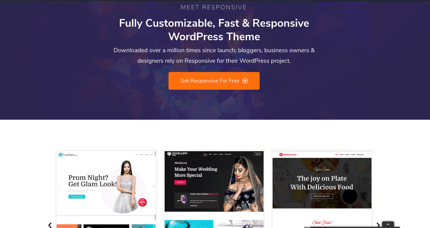
The theme has been designed by keeping a modern and stylish design in mind. And, the fact that the theme has been downloaded more than a million times says it all about its popularity.
Absolutely free to download, this theme also has a pro version to it that comes with stylish template designs and other amazing features. Moreover, since its last update, the theme has got several changes as well.
So, without any further ado, let’s dig a bit deeper and find out more about this theme.
What Can You Expect from a Responsive Theme?
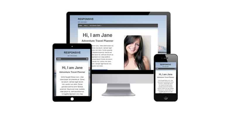
Having an adaptive design, Responsive theme looks good on every device, be it a tablet, desktop, or a mobile.

It has default schema.org markup, it helps to improve your site ranking. Moreover, as per the expectations, this theme also works well with caching plugins. Responsive is also compatible with Elementor and WooCommerce.
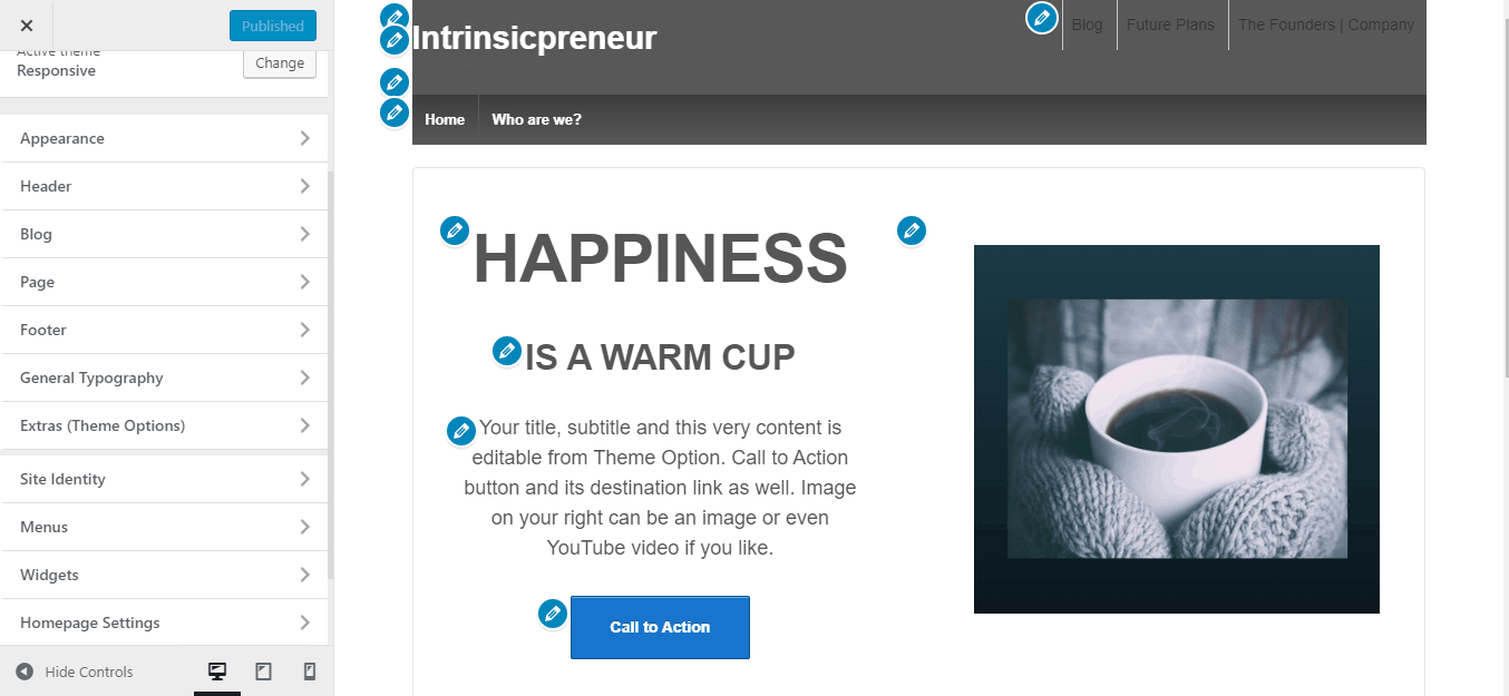
Through the customizer section of this WordPress theme, you can handle all of the customizations and edits. Here, you can even see all of the changes in real-time. Not only that, but you can also find options for menu, typography, layout, and other elements customizations.
This WordPress theme also provides an add-on that you can use to import pre-created designs. This way, you can develop a professional-looking website within a matter of time.
How Does Customizing Website Work?
You can download this theme from the inventory of WordPress without paying any cost. If not, you can also install and activate the theme from the dashboard of your website by searching for Responsive CyberChimps in the search bar.
One thing that I liked about this theme is that it comes with a pretty basic layout, much like a blank canvas. And hence, you get to customize the theme as and however required. With the help of customizer, you can change colors, adjust the layout, add and delete elements, thus, make it look more professional and elegant.
When it comes to styling web pages, the simple preview area could be quite useful. There, you would see different pencil icons that will help you find corresponding options for a particular element.

As far as header and footer customization is concerned, you’re up for several options in hand. In the header section, you get to change the styling of the menu, whether you want a dropdown one fullscreen, or sidebar, you have all the choices there. You also get complete control of designing menu colors.
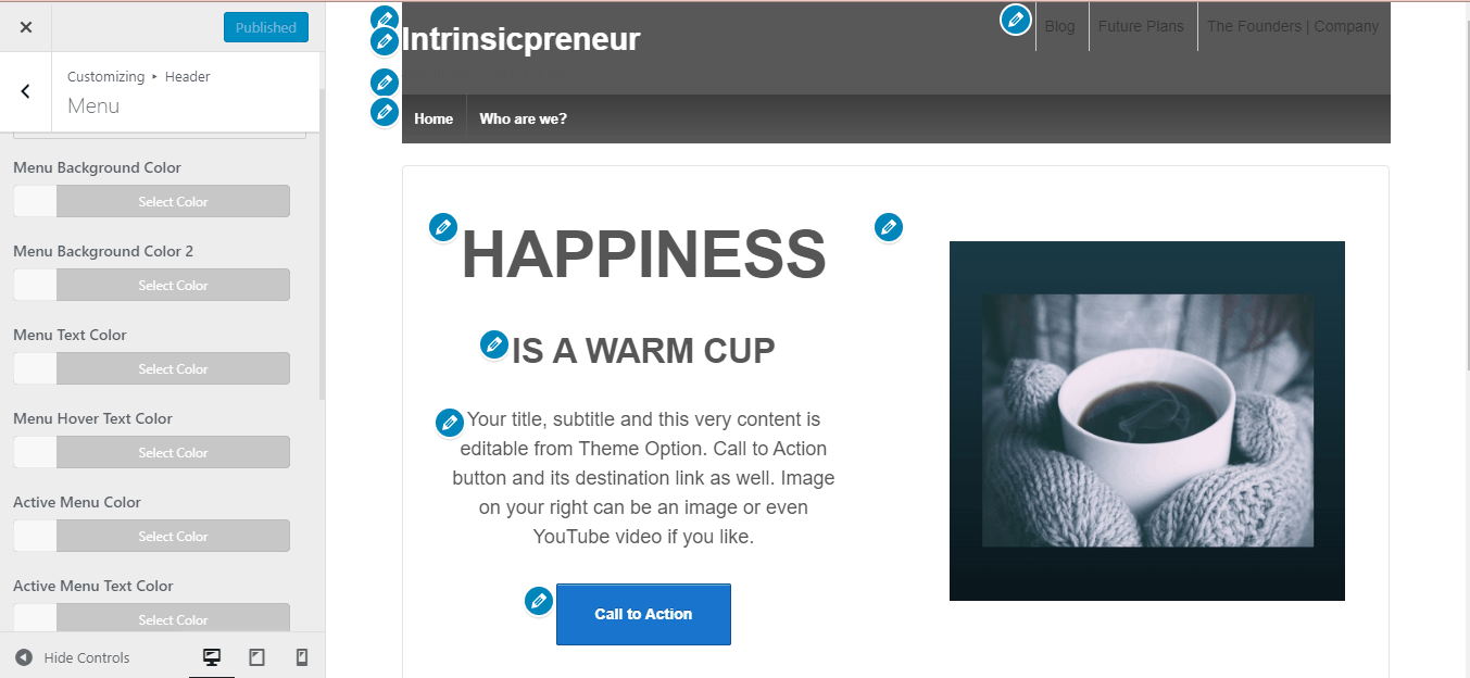

Apart from that, you can also take care of the logo’s position and color schemes for the header section.
Similarly in footer section, you can set layout, and color variants as per your own wish.
With seamless drag and drop functionality, you can effortlessly design your web pages as well as blog posts.
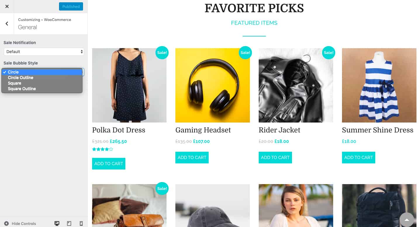
Further, in case you’re setting up a WooCommerce website, Responsive has made it easier to customize the store. Right from product sale notice, product catalog, checkout, to colors, you can customize almost every part of your store as per the theme of your brand.

Keeping in mind the era of varied devices, Responsive has made sure that you preview how your platform is going to appear on different devices. For that, while you are editing, click on the device option at the bottom, next to Hide Controls, to see the appearance.
There is one more Extras section for additional configuration. You can add PHP scripts and embed them into the header and footer sections. Talking about the header, you can also set a sticky header with Responsive. Here, you can also add icons to your social media platforms as well.
Quite frankly, I liked the way they show changes in real-time. This helps us know whether the site is going in the right direction or not. If not, alterations and edits can be made any time again.
Importing Sites:
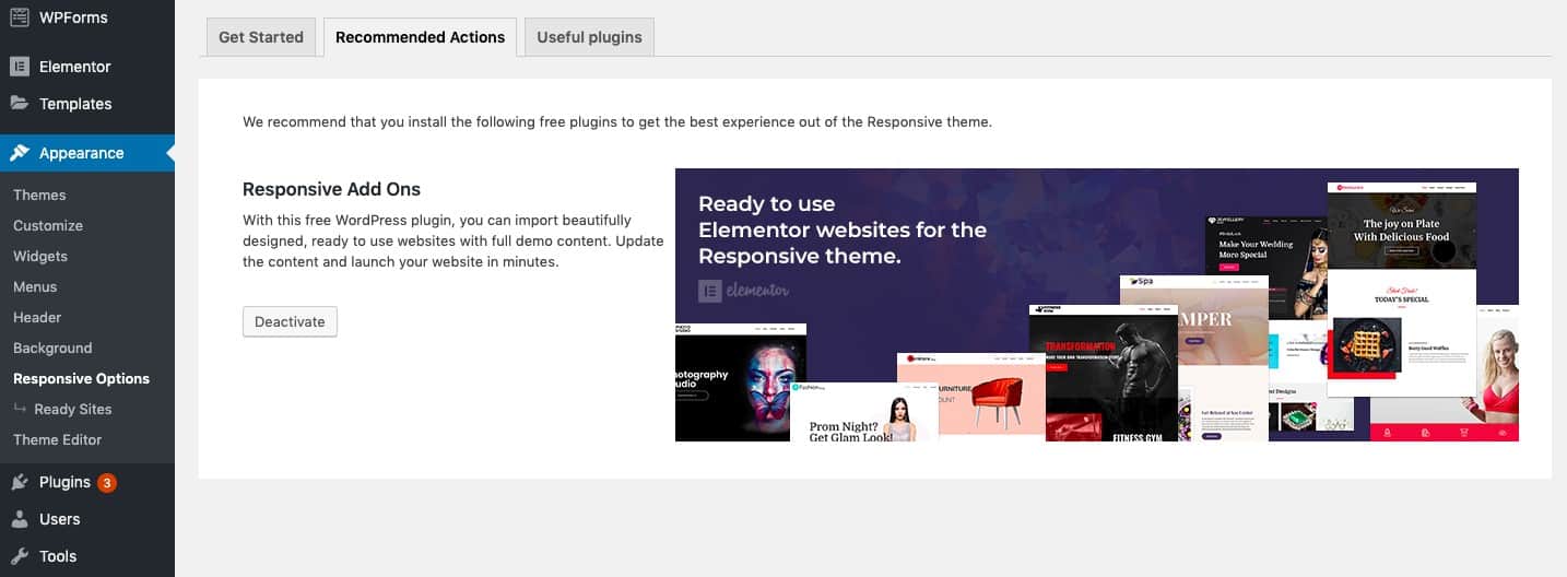
Now that you can take care of customizations through the customizer section, just so you know, there is also a different option that allows you to make the best use of the Responsive plugin. By visiting the Appearance menu, towards the end, you can see the Responsive Options page, which would be linked to the page of theme documentation.
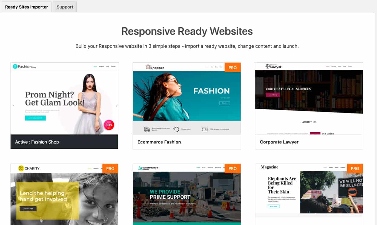

On this page, you’ll find an add-on that will simply help you in importing pre-made websites. From the Responsive option area, you can seamlessly activate the plugin and continue with your task of importing demo sites. If not, you can also get this plugin from WordPress.org.
Although you’d find 30+ Ready site designs, however, if you’re using the free variant of this WordPress theme, you could only access 17 of them. Also, keep in mind that these pre-made designs are built with Elementor. It is easy to update with the drag and drop functionality. Hence, you’d have to install the Elementor plugin to work with them.
Importing the Pre-made Sites:
Importing demo sites is as easy as a cake-walk. And, that’s one of the significant components that make this theme worth a shot. By following the below-mentioned steps, you can ensure providing a proficient looking website to your target audience. You need to install the Responsive Ready Site Importer to set up the ready site.
- Click on the template to see design’s preview
- Once you’d choose a perfect one, click on the import button available at the top
- You’ll be then redirected to the next page where you can see what will happen after importing the design; confirm to proceed
- Once you’ve imported a design, it will automatically delete the previously imported content, which could be a plus point
One important advantage here is, you don’t need to install any additional plugin for site set up. The importer will install and activate the required plugins, demo content, and images.
How Is the Premium Version of Responsive Theme?
If you’re just starting, I’d recommend you to go with the free version, which comes with a satisfying number of features and elements. However, in case you’re looking forward to having better support and access to premium ready websites, then you can upgrade the theme to the other variant.

Currently, you can purchase the pro version at a cost of $27/year, which is quite affordable. But, you’d be able to use this theme for only one website presently. In the future, there are chances of CyberChimps coming up with more packages.
Another great thing about this theme that I liked is that if you aren’t satisfied with the premium version, you can claim for a full refund within the 30-days purchase. Thus, it keeps you at a profit from all sides.
Wrapping Up:
It’s obviously evident that CyberChimps has improved its products tremendously over the last few years. And, as far as this specific theme is concerned, it’s apparent how flexible it could be for your platform.
With this Responsive theme review, I’d like to conclude that if chosen, this theme can provide you several customizing options. And then, an extensive list of Ready sites is always an additional benefit.
To be sure of how beneficial this theme can be, it’s recommended that you step ahead and try out its free version. If things go well for your online platform, you can then try out the premium version if required.