4+ Call-to-Action Button Best Practices
If you look up advice on how to boost conversion rates on your website, you’re likely to find several best practices. Elementary improvements such as speed and mobile optimization, removing distractions, adding (non-spammy) pop-ups or polishing copy really do work. But there’s one aspect of your web pages that you should spend some extra time on – call-to-action buttons.
But why are CTAs so important?
Well, the secret lies in their purpose. Generally, conversions are defined as happenings when website visitors take a specific, pre-defined action. That can be anything, from filling out a form, signing up for a newsletter, subscribing to your service, downloading your app, to adding an item to their cart. Now, the only way for your web visitors to get from your homepage or landing page to the goal you’ve set as their intended destination is by following a deliberate path. And that’s where CTA buttons come in.
By optimizing your calls to action, you can significantly boost your conversion rates. Even more, you can get a higher ROI out of your marketing efforts, without actually having to up your spend.
So, if that’s a concept that sounds good to you, here are the best practices for CTA buttons you should definitely try to follow.
1. Purpose
The main characteristic of CTAs that convert is that they need to have a clear purpose. What’s more, there needs to be logic behind that purpose, so that the button is, essentially, an extension of the path your customers have taken so far.
So, how do you make your CTA buttons logical?
Well, for one, you need to make sure they’re in the right spot (more on placement in a bit). This means that you have considered your customer’s journey, and have placed the button in a section of the website that complements the content they’ve seen so far.
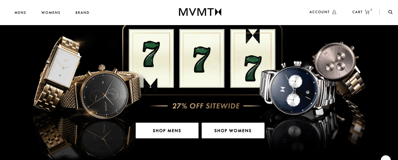
Take, for example, the watchmaking company MVMT. Their homepage includes two CTA buttons that lead potential customers to different parts of the website. One is for men’s, and the other for women’s models. This way, the customer has the opportunity to head straight to the section of the website that is of interest to them, without having to go through a time-wasting collective page, risking a bounce.
 Secondly, a great CTA button needs to offer a solution to a customer problem. The fortunate thing is that you have already defined customer pain points during your product development phase, which ultimately means that you already know what it is that you’re offering.
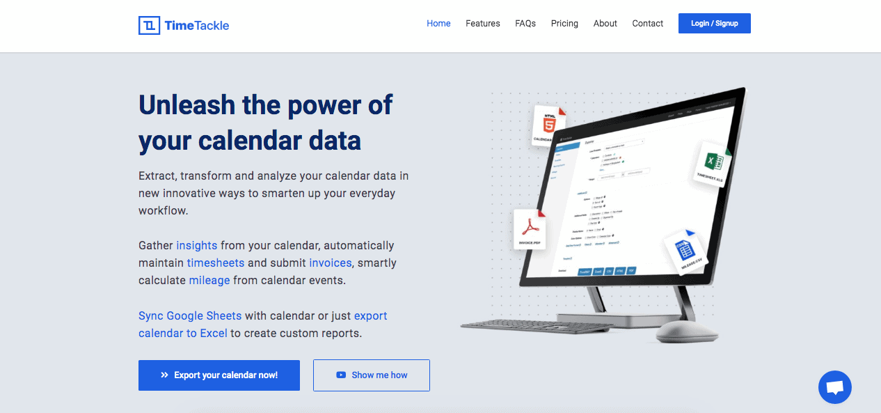
As an example of a company solving a customer issue, TimeTackle offers help. They already know that their website visitors include people who are looking for powerful calendar software with multiple integrations. So, their strategy is to encourage them to get the most out of their existing calendar data.
2. Placement
Obviously, your CTA buttons need to be located on the parts of your pages that are the most easily accessible. We’ve already covered the fact that any button needs to be placed logically. But, there’s also the question of visibility.
On the whole, you should aim to make CTA buttons the most prominent features on your webpages. That means that they need to take a central position, as well as to have a designated spot in your menus and benefits sections.
As an example, you can take the Philips Hue homepage. It displays three different CTA buttons, but they all lead to the same place.
- The first, “See products” button is featured in the main header. Customers who are already familiar with the company’s products are likely to go straight for this location, as they’ll want to go to the store and make their purchase based on previous research or experience.
- Someone who is just browsing is likely to go with the “View all products” button in the next section, as it’s located right below a series of icons showing different Philips Hue goods.
- Lastly, a customer at the top of the sales funnel is likely to scroll down the homepage, familiarizing themselves with the company’s offerings, and click through on the last CTA.
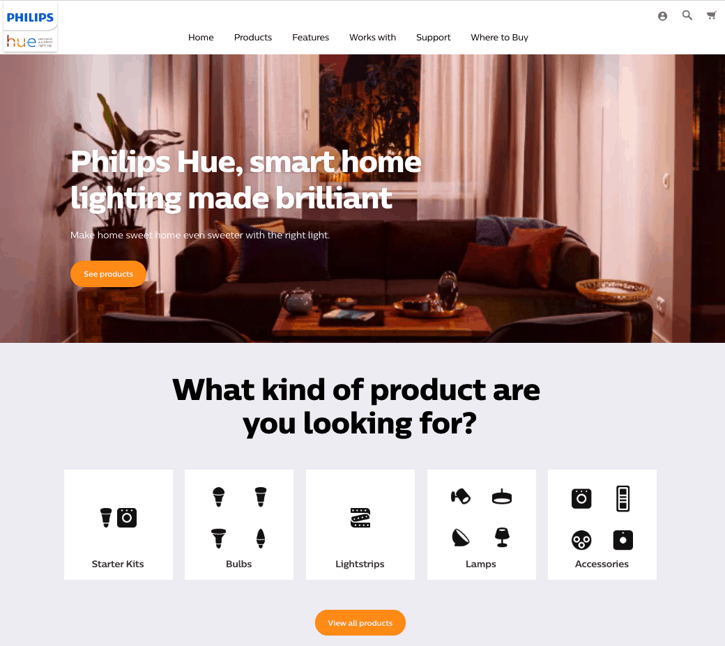 Another thing to note about Philips Hue’s website is that most buttons use a nice amount of white space around them, for maximum visibility. However, the placement falls slightly short on the header image, where the bright orange of the CTA clashes with the colors of the background. It’s definitely an area that the company’s design team could improve on.
3. Color
Another thing that’s going to determine whether website visitors click on your CTA buttons is how they are designed. White space is always a good idea, but you can also do quite a lot by changing just their color according to the brand emotions. This was best demonstrated by a test done by Hubspot.
They conducted an A/B test on a page, where the only difference between the two versions was the button color, with one being red and the other one green. What they found was that the red button outperformed the green one by 21%. Now, this isn’t to say that everyone should just make their CTA buttons red. No, it’s an indication of how important it is to make design decisions that suit your brand the most, as well as to always back up your choices with evidence.
If you take a look at this example from Khan Academy, you’ll find that their design choices don’t necessarily fall in line with all the best practices listed here. However, they are completely in line with the company’s mission and values, which, in the end, is what makes them the best choice.

4. Copy
Other than making the right aesthetic decisions, you need to remember that great CTA buttons also rely on a high-quality copy. Generally, a successful call to action will:
a) Be short
As you’re working with a limited amount of space, you need to remember that a good CTA button must retain its visibility and readability on all screen sizes. This means that it should contain five words or fewer.
Of course, you don’t have to go with the standard “Join Now,” “Sign up,” and other common phrases (though there’s nothing wrong with using them). You could very well come up with something original, as shown here by Yale Locks. But, make sure to check that the copy is easily readable, and equally compelling regardless of whether it’s consumed through a desktop computer or small smartphone screen.

b) Use persuasive words
Research suggests that some words are particularly effective at not only grabbing people’s attention but also at making them take a certain action. In addition to the obvious contenders of “save” and “free,” it’s also not a bad idea to have your CTAs include instructional verbs. Words such as discover, learn, guarantee, reserve, etc., are more likely to result in a conversion, so see whether you can make them a part of your copy.
c) Engage web visitors directly
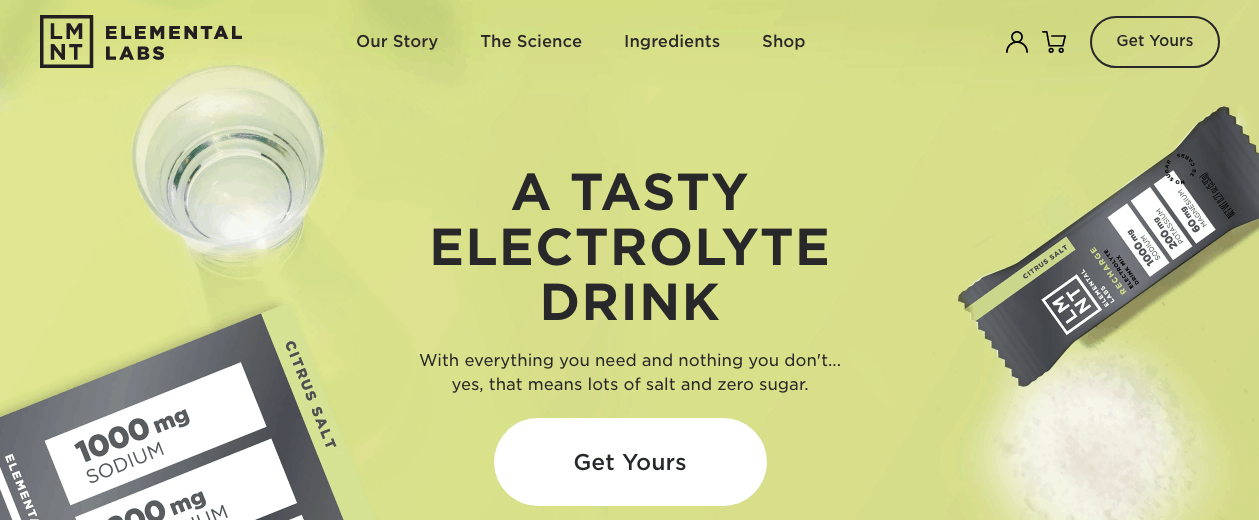
Always remember that the key to a successful business is a customer-first approach. And this extends to your calls to action as well. As you can see from the examples below, there are two ways of doing this. Following the more common method of addressing visitors, Elemental Labs uses second-person pronouns. In most cases, this will be the best choice, as it will sound more natural.
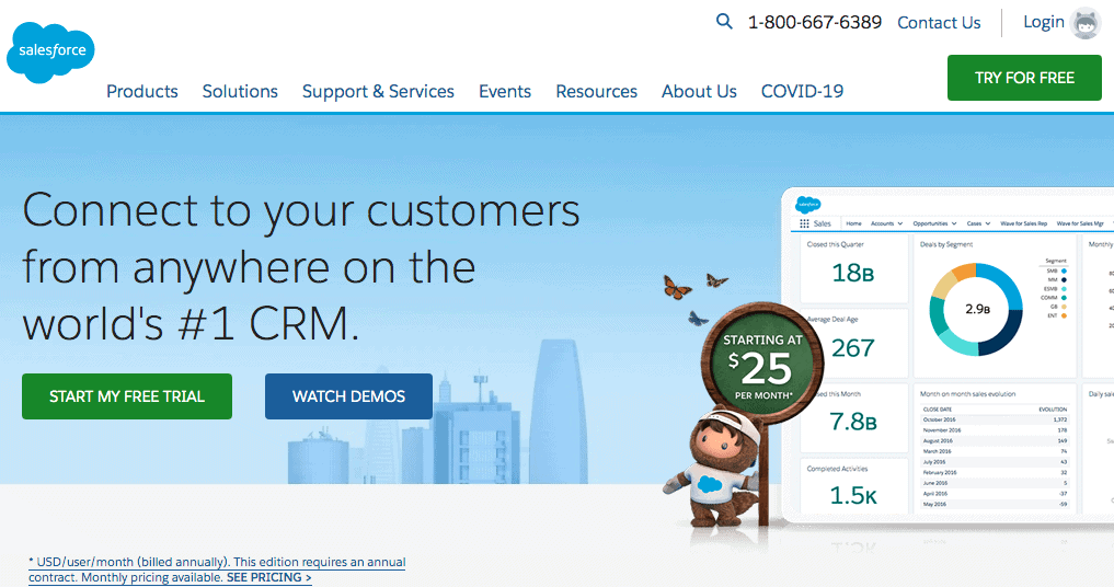
 However, there are some instances in which you can use first-person pronouns like Salesforce does on their homepage. This is a great way to personalize user experience, which may, in fact, result in a higher likelihood of a conversion.
d) Create a sense of urgency
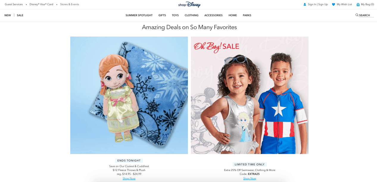
Last but not least, remember that your CTA copy needs to work immediately, not three months from now. That’s why it’s not a bad idea to create a sense of urgency. There are several ways of doing this. You could add the word “now” to your CTAs. Alternatively, you may choose for your CTAs to include a timer or to be preceded by a phrase such as “Limited time only,” as seen in the example below.
Final Considerations
When designing CTA buttons for your website, following these best practices is one of the best ways to ensure conversions. But it’s equally important to remember that what works best for your business is going to depend on your brand and your target audience. So, in addition to following the advice above, always make sure to conduct testing and track your key metrics. This way, you’ll be able to make any necessary changes and get the absolute most out of your landing pages.
- What Is the World Record for Block Blast? - February 23, 2026
- How to Fix Error 1005 Access Denied (Cloudflare Fix Guide) - February 22, 2026
- SOS in Morse Code: What It Means and How to Use It - February 22, 2026
Where Should We Send
Your WordPress Deals & Discounts?
Subscribe to Our Newsletter and Get Your First Deal Delivered Instant to Your Email Inbox.
