Movipress – Convert a WordPress Site into an Android App to WoW Mobile Users
Not so long ago, the only way to meaningfully browse the web was with a computer. Since then, times have changed considerably and today most of us use phones to satisfy our internet needs. Coinciding with this change the market as a whole has undergone a paradigm shift with “regular” sites being adapted with smaller screens in mind. This change was, at first, centered around responsive pages that simply reformatted the site display specifically for the screen you’re using.
The next step and one we’re seeing more and more of is not simply converting a site as is, but replacing the site with a native app specifically designed for your phone. Converting one into the other is no small task, but what if we told you there is a WordPress plugin that will enable even beginners to it successfully without much fuss and with zero coding – that plugin is called Movipress.
Simple on the backend, professional on the frontend
First of all, we have to point out that Movipress currently converts sites to native Android apps only. As of yet, there is no option to convert for iOS but it’s coming soon. Also, the plugin doesn’t work with WooCommerce sites, so it’s just for pages, posts, articles, etc.
Now, most of the managing is done through WordPress just as you would do for any other site. And after you’re ready you can publish it on the Google Play Store. In order to accomplish all of this, you’ll need to combine your WordPress work along with Google Firebase and the Movipress plugin. All of this sounds like it could be complicated, especially when you consider how many avenues you’re combining. Regardless of how it may sound, you can get a working app done in around 20 minutes from which you can then build on.
We’ll look to cover the whole process in snippets so you can get an idea of what you’ll be getting into. The first thing you need to know are the requirements for actually proceeding any further with your work and those would be:
- a self-hosted WordPress (v4.7+) website or a WordPress Business account
- a Google account
- a 32-bit PNG image of the website/brand
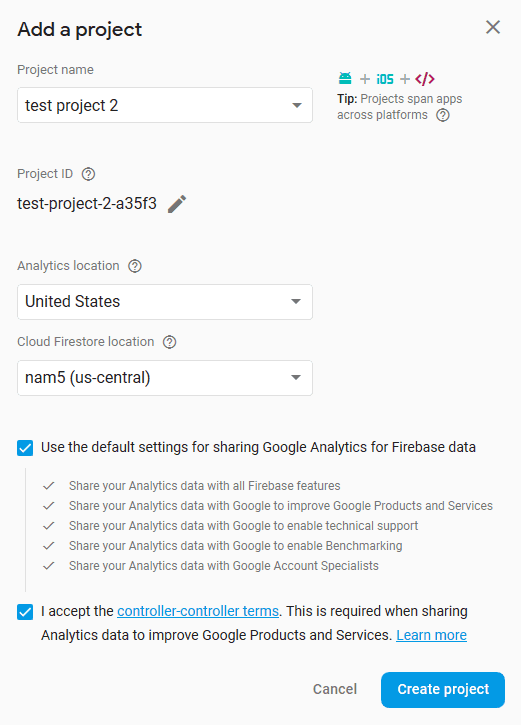
Once you have everything you need you’ll want to start it all with Firebase and create a project. It’s all straightforward – pick a project name, assign the location and create the project.
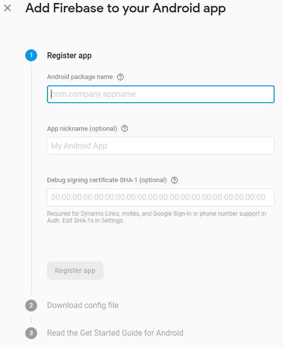
After the project is created you need to add an Android app. To do this you’ll need to register the said app with the package name. Use simple designations that are easy to remember because you’ll need them further down the line in the steps that are yet to come. When you’re done just hit the “Register app” button.
That’s essentially it for the Firebase part of the process and now we can move onto the plugin itself. Before you’ve moved onto the tweaking part in WordPress there are still certain things that need to be done on the Movipress site.
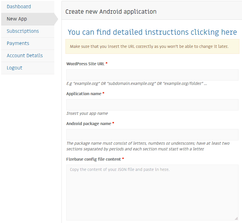
Naturally, you’ll be required to create an account before you go any further. Then, you’ll need to incorporate the project you’ve made in Firebase. Now is the time you’ll be using those designations we pointed out to remember a few steps ago.
The first part is solely about connecting work you’re doing on both platforms, or rather transferring all the required designations. The second part concerns the visual style your app will represent which is the part every designer will simply adore.
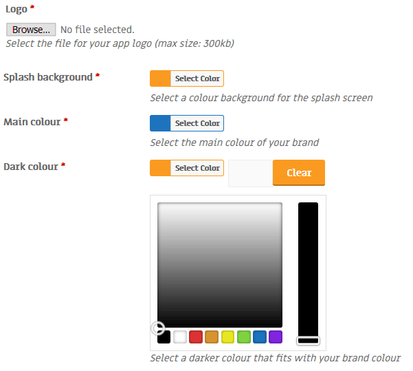
This includes the logo and colors you’ll be using. More specifically colors of the splash background, as well as the main color and the dark variant. These will be the first things your visitors see once they’ve accessed your app, so be mindful of what you choose.
With everything mentioned, you’ll be essentially done with everything you need in order to get to the real work – configuring your app through WordPress for optimal performance.
Editing in WordPress – content related
Technical details are the first to be addressed. Depending on how you want your app to be used, you’ll need to check some options before going further.
- Secure connection – if your site has a secure connection (which generally most of them do), you should let your visitors know to make them feel secure while using your app.
- Right to left reading – depending on where you expect your app to be used, you should look to configure it to best suit the needs of your users. If the main, or at least the majority of the audience uses the right to left reading, we suggest to strongly consider using this option.
- Privacy policy – all of us are well aware of the GDPR rules that were implemented worldwide, that made all sites, regardless of content modify the way they do business. There is a default privacy policy that you can use which is pretty straightforward. However, if you do have a somewhat different or specific set of rules, then be sure to dedicate a page just for them.
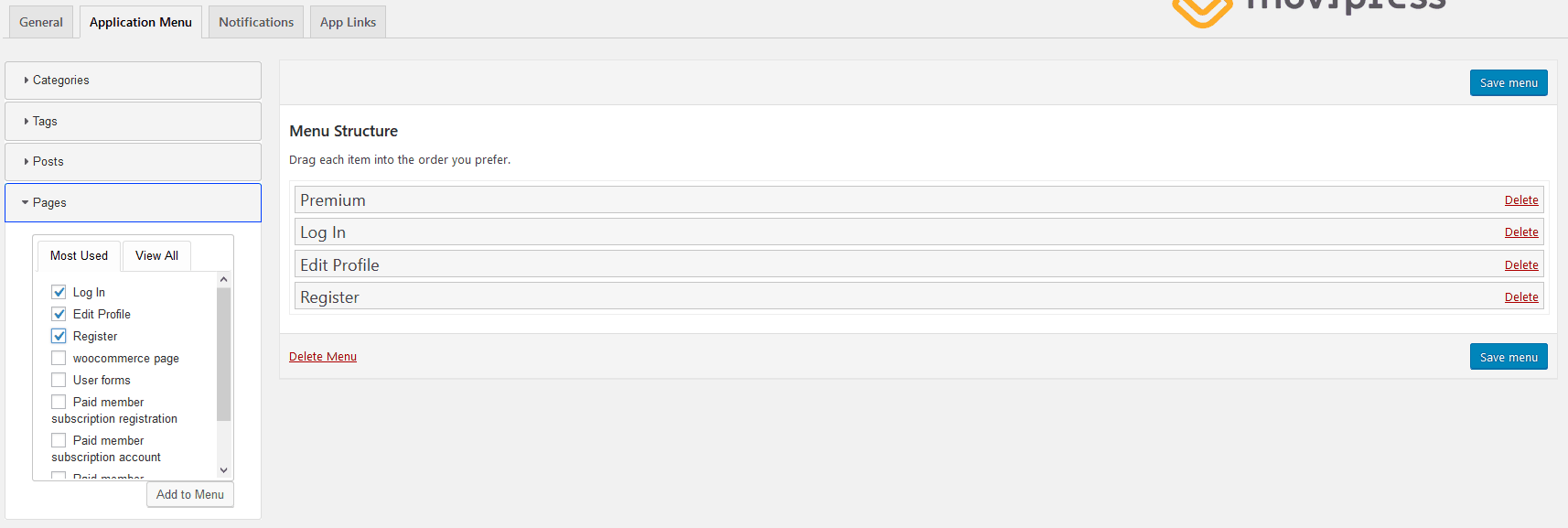
All apps with this type of content (post, articles, etc.) essentially function as big menus that are specifically designed for use with elongated, narrow screens on our phones. It’s natural then to figure out that the functions and look of the menu are some of the primary concerns when converting your site into an app. With Movipress the menu configuration is really easy to set up.
Just select all the categories, tags, posts and pages you want to be represented in the main menu structure and you’re good to go. The best way to make most of this method is to create classifications of all of them beforehand.
With good designations in place before you start, you’ll be able to maximize the impact of the menu with perfect sorting and tagging of both similar and different elements. Although this type of approach is prudent to adhere to even when we’re talking about “regular” pages it goes double for mobile apps because of the limited interface options i.e. there can’t be functional multiple tabs or windows and the input of a mouse and keyboard provides much more options and variety than a touch screen.
Keeping in touch and getting information as fast as possible is key nowadays. It’s precisely because of this that more and more sites, channels, services, etc. opt for notifying their users every time there is a change regarding content. Of course, nobody will be notified while you’re working on something from the backend and are making little tweaks. These notifications are implemented to inform your users of the change in frontend content like new post releases, or old post updates.
No one will argue that notifications are important and you want for your users to enable them to keep them constantly engaged with your site and the content you’re putting out. Based on the nature of that content however, you’ll want to configure how much notifications are too much. Publishing notifications pretty much nobody can argue against. On the other hand, updating notification can be tiresome for your users if there’s too many of them.
Let’s say you’re featuring content related to a tech conference. Your first article is a preview of a new product scheduled to be presented. You’ll then update during the presentation with a few key notes and finally, you’ll update after everything is done to relay your thoughts. In practice, this is over three updates on a single article in a span of maybe a day – definitely too much for the average user. This was simply an example of a situation when it really can be too much – nobody knows the content you put out better than you and you should configure everything in a way it suits you best.
To make these notifications work, you’ll need to head back to that Firebase project you’ve started. Once on the platform, you’ll need to get the server key, which you’ll then need to input in the plugin in WordPress.
The server key can be gained by going to your project settings and then to cloud messaging. After that, it’s a simple matter of copying the provided key back in the notifications tab of the plugin.
Now, we’ve already touched on the benefits of good site organization when talking about the importance of menus in apps, but there is another navigation method that is equally important – links.
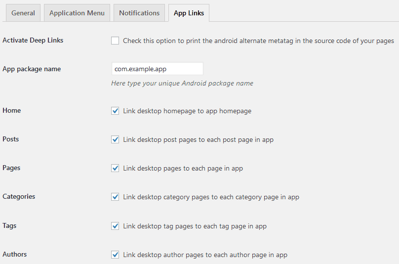
Because of the limitations of touch screen input and mobile displays, in general, every navigation option is that much more important on an app than on a computer or tablet. There is no room for non-essential features and everything needs to be trimmed down to the basics. Links are a perfect way to ease navigation. A well-developed linking tree is one that purposefully connects categories, pages, posts, tags, and authors.
The way in which you connect them is irrelevant and solely up to you, as long as it keeps your users browsing the app, following the threads you’re putting before them. The perfect example of a fantastic linking process can be seen on YouTube when you start with a video on how to fix a leaking faucet and find yourself looking at cats playing the piano 3 hours later. It doesn’t matter how you got there, what matters is that you’ve spent 3 hours on the same site just browsing the content it has to offer.
As you can see, from a technical perspective linking is just a matter of ticking and unticking a box. Making meaningful connections is work that needs to be done beforehand, this is just the final step that enables everything.
Editing in WordPress – visual identity
You’ve prepared everything content wise – the foundation of everything you’re doing is in place and ready to go, but there is one more thing you need – a visual identity. First impression matter, it’s as much true for people as it is for websites and apps.
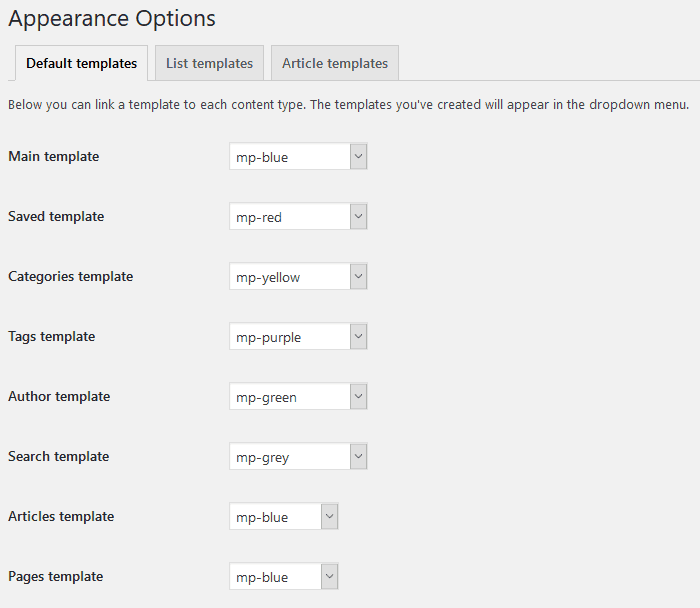
No matter how good your content is if the wrapping isn’t appealing you’ll be losing potential visitors/users every step of the way. That is precisely why your app needs to look good, there really isn’t just any way around the fact. Luckily with Movipress, you’ll be able to make your app look good without having to spend hours upon hours going through every little minuscule detail of every element that will be present. To clarify, you will be able to do exactly that, but you won’t have to. Namely, you’ll be presented with several templates to choose from with different color pallets and slight design differences.
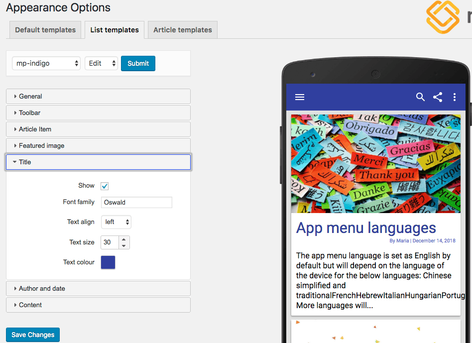
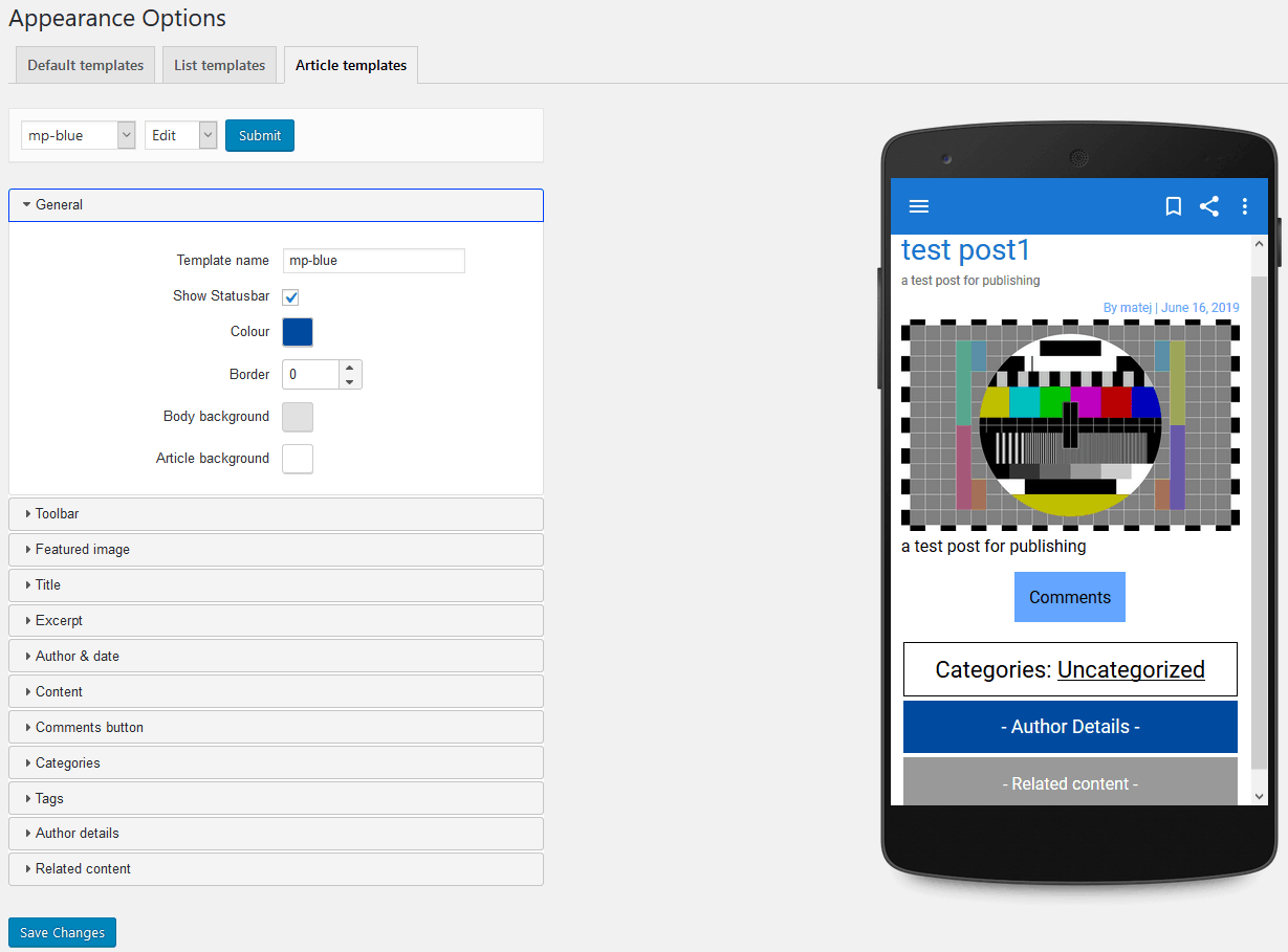
Although the templates themselves are already configured in a way you won’t have to change anything to make them work seamlessly, they are just a starting point. Every element that’s represented on the page in the app is subject to change in two main categories – the list template and the article template. Both of the editors have a handy preview where you can check for the changes exactly as they’ll appear on from the frontend on a phone.
The list, as you would expect, is the main navigation hub of your app. Here all your content is displayed and accessed and is, therefore, the first thing a user will see once they open the app. The only advice we can give is to try and capture their attention, be it with impactful images or notable headlines it doesn’t matter.
Once they are through the door you’ll then just let primarily your published work do the talking, but still, look to make the articles nice to read through. Since there is much more content concentrated in articles, there are also more elements that need to be taken into account both functionally and visually.
Try to make articles appealing, but still simple. If you’ve gotten this far, then you already have an idea of the limitations users face regarding interaction methods and display – two key features mentioned numerous times already throughout. An example of how everything looks from the app can be seen below.
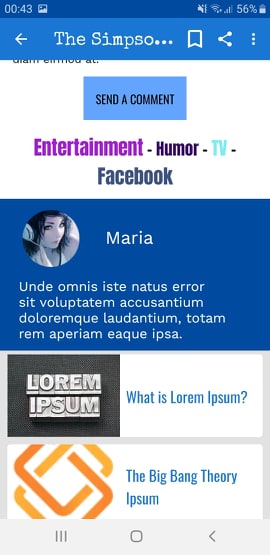
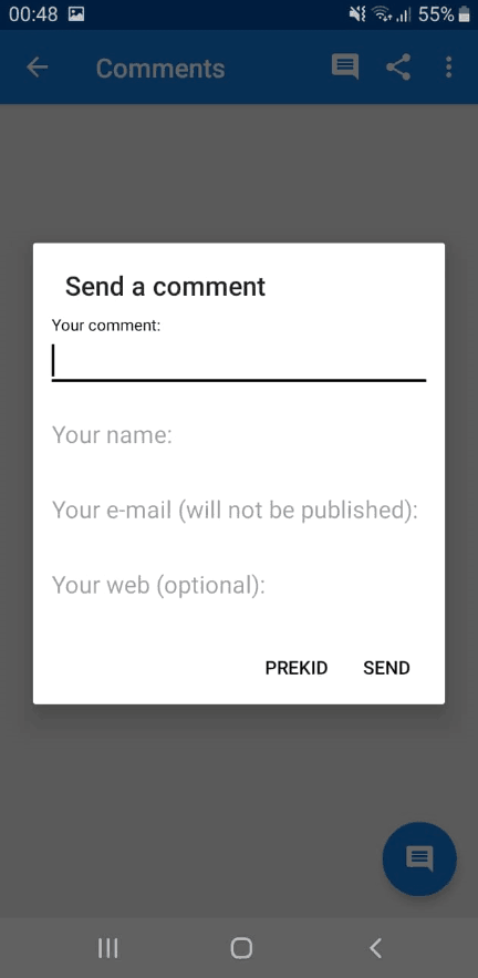
All of the screenshots are taken directly from a phone, so you’ll easily see the article design along with connecting links, categories and an author snippet, pop-up windows, and a fully realized menu.
As you can see, once all the databases are set up fully you can expect some impressive results. Keep in mind these are just the test apps that we are showing, so there is still much room to grow further. The further into specifics you go the better it will look.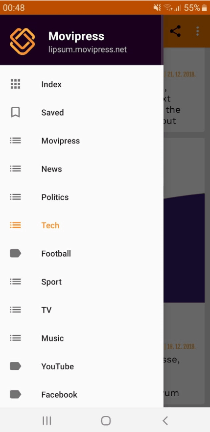
With just the basic systematization you can clearly see the category linking easing the navigation. Furthermore, once you’re done with the article, you’re instantly prompted with the option to interact, both in relation to the content and with other users, as well as presented with related articles to keep you further engaged.
Comment posting is very straightforward and the mechanics of it will definitely not discourage anyone from voicing their opinion. It’s done elegantly, through a pop-up where if you decide not to leave anything just swipe anywhere and you’re taken back to the article. Finally, you can observe a menu full to the brink with various categories, again for easing navigation making a life for your users that much more simple and enjoyable.
Editing in WordPress – advertising
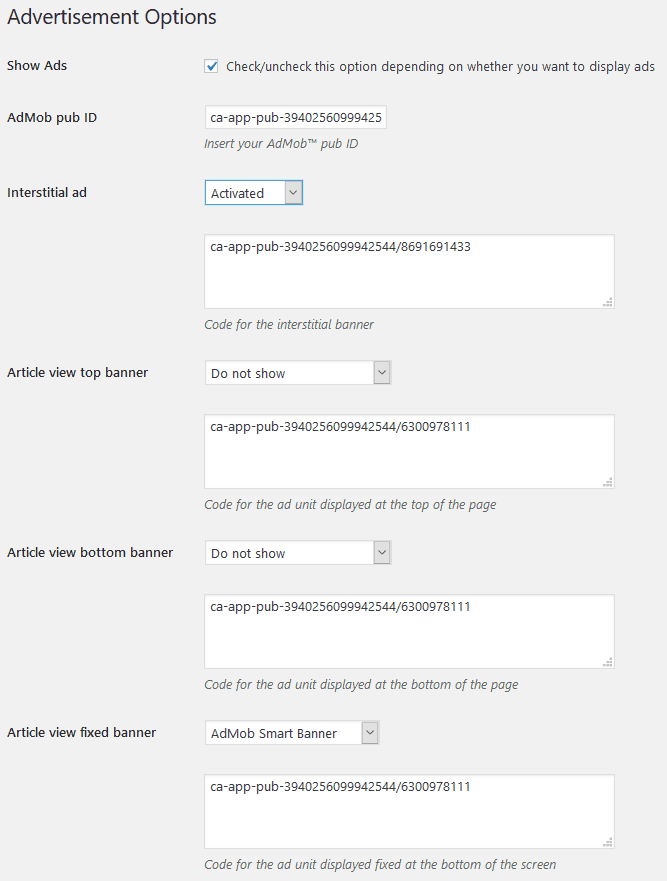
The final feature that we haven’t gotten into at all so far is advertising. If your site or app is free of charge for all visitors and users, technically the only way to profit from it is through advertising.
This is the norm today in order to keep the content free and even subscription sites consider ad-free space as a premium feature, removing them only for paying subscribers. In line with that train of thought, you should strongly look into implementing ads, but still, keep it on a level that won’t have a negative effect on your users.
In order to incorporate ads into your articles, you’ll need two things – an AdMob pub ID and the premium version of the Movipress plugin. Until now we haven’t emphasized this, but Movipress and all the features it brings are absolutely free.
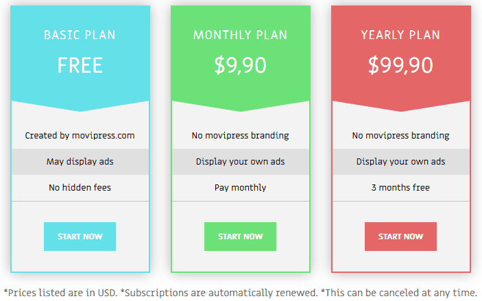
The premium version is available and the only difference concerns the advertisement options. If you opt for the free version the ads that are displayed on your app are the ones Movipress and its developers are promoting. In case you opt for the premium version of the plugin (pricing below), then you can insert your own ads that are in compliance with the rules and ToS from Google.
Implementing advertising that is thematically suited to the content you’re publishing is a great way to, at the same time, give your users the chance to buy the things you’re writing about and keep your app running smoothly from a financial standpoint with ads for the things you’d be writing about regardless.
Doing advertising this way lets you present a cohesive whole that guides users from the initial introduction to a product or service all the way to the final step of purchasing it.
Movipress is free & your site needs it
We can’t emphasize enough how important it is to cover all the bases when running a site. You want your content to be plastered all over screens of all shapes and sizes. In today’s world, most of those screens fit in the palm of your hand and therefore it’s your responsibility as the content provider to make your content as accessible as it can be.
Apps are simply the easiest way to do so and if you’re not using one then you’re simply not fulfilling your full potential. Add to that the fact that a conversion plugin like Movipress is free and you really don’t have an excuse not to provide the best possible functionality to all your followers. Opting for the premium option means you’ll be able to get the most of financial potential as well. Whichever way you choose to go, you surely won’t be disappointed with Movipress.
In the end, we invite you to try the sample app developed by the Movipress team so you can see the full potential of the platform.
- How To Make a WhatsApp Group Interesting? - July 4, 2024
- Top 6 High-Paying Affiliate Programs in 2024 - June 14, 2024
- What is DragGAN AI Tool and how to use it? - June 7, 2024
Where Should We Send
Your WordPress Deals & Discounts?
Subscribe to Our Newsletter and Get Your First Deal Delivered Instant to Your Email Inbox.
