

So, you’ve finished designing a fantastic WordPress (WP) site for your client, huh? That’s great! But now, they’re asking you to show it on their 70-inch TV with a 16:9 aspect ratio. Your eyes widen, wondering whether the site that looked awesome on the desktop will still look pixel-perfect on a large screen.
If this has been your all-time struggle and you’re dead-tired of it, Elementor’s Page Builder has the ultimate solution: the Elementor 3.4 and its Additional Custom Breakpoints (one of the most requested features).

With Elementor 3.4, you can instantly size your designs correctly for any screen and powerfully accelerate your WP’s site performance for an enhanced user experience (UX).
Sounds terrific? Read the rest of this guide to learn how this version upgrade does just that.
Breakpoints Eliminate Design Restrictions
Breakpoints are the “points” in which your site’s content responds accordingly to the device’s width with the best possible layout. Let’s say you inserted four images in a row on a product page but wish for mobile visitors to see only three. Breakpoints instantly customize your design and act as borders for the layout that best fits specific screen widths.
By adapting styles to every device, breakpoints enhance your visitors’ experience and help them consume the information more seamlessly. Elementor 3.4 gives you four additional breakpoints for each: tablet, laptop, widescreen, and another mobile gadget (besides the two default ones for mobile and tablet).
It also enables you to adjust your WP site’s layout for up to seven devices., which gives you greater flexibility and control when designing your website.
With this Elementor 3.4 feature, you can freely:
- Select active breakpoints: aside from the original desktop, mobile, and tablet breakpoints, you can add more for other screen sizes
- Pick each breakpoint’s values: elementor lets you manage every breakpoint’s values
- Scale the preview higher or lower: you can zoom out to preview your design on widescreen devices Elementor also lets you work on a screen smaller than your design is intended for — while still seeing its more extensive view
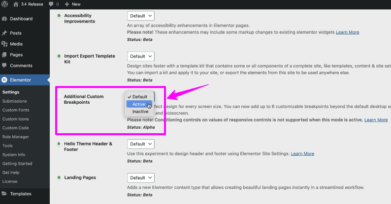
The additional custom breakpoints by Elementor 3.4 are currently available as experiments. To test them out, back up your WP website first. Note: an Elementor-recommended practice when testing new features is to do so always on staging environments before applying them to live production websites.
After backing up, head to Elementor > Settings > Experiments and set the Additional Custom Breakpoints option to “Active.” This activates the new responsive panel in the editor.

With these additional custom breakpoints, you can completely supervise your design for various devices with picture-perfect viewports. You can also run an entirely responsive WP website UI without wrecking your performance (more on this later).
Sizing Your Designs for Different Devices


Elementor employs a cascading concept across the breakpoints and scales down for each device except widescreen. Keep in mind that desktop is always the default for your layout. This automatic setting influences the remaining breakpoints for smaller and larger screens.
A sample application for this is setting different titles for each breakpoint. Say you put in 90 px for your title’s text size for desktop screens. This value applies to other breakpoints. If you modify your tablet breakpoint and set the title’s size to 70 px, it goes the same for all more minor breakpoints, including mobile-extra and mobile.
However, the style you’ve input for the tablet will not apply to bigger breakpoints (tablet-extra and laptop in this example). These larger screens’ breakpoints stay at 90 px — the exact figure for desktop settings.
Identifying Specific Styles Set on Breakpoints: a New UI Update
Every added custom breakpoint comes with the need to recognize precisely the styles inherited from one breakpoint to another. Because of this, Elementor included this new user interface (UI) enhancement.
Let’s take the previous title-size-setting example. Say you set the margin on a tablet to 20 px and proceed to a mobile-extra view. You will then see that Elementor presented the inherited values on controls (e.g., background images, margin, padding, and other numeric controls) as placeholders.
With the above example, the 20 px set on the tablet becomes a visibly greyed-out placeholder on all devices smaller than the tablet. Remember that you can only adjust the style per breakpoint for values with device icons beside the titles when using this function.
WP Site Performance Enhancements
The Elementor 3.4 builds on prior versions released in 2021, including a conditionally loaded lightbox, enhanced asset loading and accessibility, reduced extra DOM elements, and more.
From this, Elementor 3.4 offers further optimized capabilities to boost your WP site’s performance. Following are the essential enhancements:
Breakpoints Surpassing the Speed Limit

To enhance the custom breakpoints to the optimum, Elementor rebuilt its responsive control loading mechanism. As a result, the server response time skyrocketed by up to 23%, the memory usage decreased by 5%, and Elementor saved an estimated 30% off the data traffic to the editor load.
These figures prove how your WP site can now run smoother and faster than ever before. They also show how the additional custom breakpoints do not jeopardize your performance in any way, unlike other solutions that use duplicate code to achieve this same effect.
Duplicate code ruins your code quality by increasing the technical debt associated with it (which is expensive to repair). Your code also becomes strenuous to maintain. Fortunately, you can eliminate that when using the Elementor 3.4 page builder version. Consider this factor when choosing the best website builder for your website projects.
Removed IE Support and Optimized Font Awesome Loading


Elementor 3.4 introduces other performance enhancements — one of which is removing its support for outdated browsers. Elementor emerged in the market five years ago. Internet Explorer (IE) and its alternatives required extensive code duplication and support to interpret modern language.
However, these days, web browsers can natively translate modern code without needing further explanation. This is revolutionarily crucial. It means Elementor can now save up to 110KB on every page load and size, your pages get faster loading times, and your site’s UX remains excellent.
Moreover, Elementor 3.4 upgraded the Font Awesome loading. Before this enhancement, the whole library is used on a website whenever you add an icon from Font Awesome. By adjusting an icon’s loading mechanism into SVG, Elementor lessens the kilobytes and requests. This means every page you create on the platform is a faster-loading one.
Expect More Site-Optimizing Improvements from Elementor
Elementor has always been working to optimize and accelerate your WP site’s performance — and this most recent version, the Elementor 3.4, can perform the most incredible wonders by far.
As superb as this already sounds, expect Elementor to release more improvements throughout the year. This includes:
- “Load only what you need” features to streamline your page loads significantly
- Minimized use of JavaScript/CSS libraries and native browser support
- Further optimization of current internal JavaScript and CSS
All this is part of Elementor’s constant efforts to propel website performance standards and empower you to build top-notch sites. Such sites translate into greater visitor engagement, better conversions, and higher profitability.


- Pros and Cons of Virtual Private Networks in 2023 - March 4, 2023
- How Do I Keep My Logo From Being Stolen - February 27, 2023
- Create a User-Friendly Admin Panel for Any Database - October 13, 2022