Gutenberg WordPress Editor – What’s the Verdict?
The biggest change to happen to WordPress in recent times happened with the release of the new Gutenberg editor with WordPress 5.0 in December 2018.
In a radical departure from the TinyMCE Classic editor used up until now. The Gutenberg WordPress editor utilizes drag and drop “blocks” as the basis for creating content and site layout.
So what are the motivations behind such a radical change? Why is WordPress making such a drastic departure from an interface that has remained untouched for the best part of a decade, and is familiar to millions of users?
And more importantly, did they get it right? The reaction has been very divided – with some very strident opposition. Initial impressions suggest the change has not been one everyone is happy with. Perhaps WordPress hasn’t done the best job of rolling it out if early reviews are anything to go by…
But let’s look first at the why behind Gutenberg and the change to a block editor.
Why Blocks – According to WordPress
According to the blurb on the WordPress.org product page for Gutenberg, it’s obvious they had ease of use and simplicity for the average user in mind by reimagining the editor as a tool for creating rich layouts without the need for HTML or CSS knowledge in order to customize.
And customization is the end goal: “While the editor is the focus right now, the project will ultimately impact the entire publishing experience including customization (the next focus area).”
The justification for changing the whole editing interface is:
- Modernization and simplification with usability in mind, even for new users.
- A singular block interface opens a path for developers to create premium blocks that are superior to shortcodes and widgets.
- Changing the whole editing interface as opposed to only the content field lays a foundation for the area of focus that comes next. Which will be full customization – what that means exactly is not yet clear.
- Modernization of the foundation, moving toward JavaScript and leveraging the WordPress REST API.
WordPress sees Blocks as the “unifying evolution” of what shortcodes, embeds, widgets, post formats, custom post types, theme options, meta-boxes, and other formatting elements currently do. So the aim is to roll all of the functionality currently available into one consistent element, with user experience in mind – the intent is that even non-developers can intuitively craft complex layouts with no technical skill required.
Gutenberg, of course, has come about after WordPress page builders became very popular in the last few years, so something had to be done. You can see a full comparison of two of the most popular page builder products, Elementor vs Divi here, on this excellently researched CollectiveRay article.
What Outside Commentators Are Saying
Others outside of WordPress have different views on the motivations behind a move to the block editor. Iain Poulson of Delicious Brains speculates the motivations behind Gutenberg are not quite what WordPress says they are:
“Gutenberg is an obvious reaction to competitors of WordPress; the writing experience of Medium, the quick and easy site builds using Wix and Squarespace.”
Poulson argues that financial pressure from competitors is forcing WordPress to become more like their competitors in order to attract new users. He worries that this isn’t in the best interest of everyone. He also believes it is a move away from one of WordPress’s core philosophies of “Clean, Lean, and Mean.”
Furthermore, he believes Matt Mullenweg, founding developer of WordPress is going against another part of the philosophy which states:
“The rule of thumb is that the core should provide features that 80% or more of end users will actually appreciate and use.”
He sees Mullenweg as acting as “Benevolent Dictator For Life” and making executive decisions without considering users first; also part of the WordPress philosophy.
Smashing Magazine contributor Manish Dudharejia points out some of the negative aspects of the new Gutenberg WordPress editor, including no support for responsive columns – meaning custom coding is needed; inadequate design layout options, and the biggest concern for him – compatibility issues:
“Backward compatibility is going to be a primary concern for most developers. It will destroy current plugins and themes, especially ones that require integration with TinyMCE.”
Other issues users and reviewers have written about include:
- Issues around formatting when copying and pasting content. A real problem when millions of users prefer to write their content outside of the editor and paste it in from their outside source.
- The need for a new block for every single new paragraph of text content. A real pain for bloggers and those whose content is text heavy.
- No options to change colors of elements within the editor, such as buttons, etc, requiring custom CSS to do this.
- Some just plain don’t like the new interface.
- There is a criticism of the markup Gutenberg produces
The Negative Reviews
If you were to look solely at Gutenberg’s star rating and the reviews left on WordPress.org you would struggle to come to any conclusion other than the verdict on Gutenberg is that it’s been one big, stinking failure:

There isn’t much middle ground within the reviews. It seems users either love it or hate it. With those in the 1-star Hate camp outnumbering the 5-star lovers almost 4 to 1 at the time of writing.
And many users aren’t shy about sharing their frustrations:
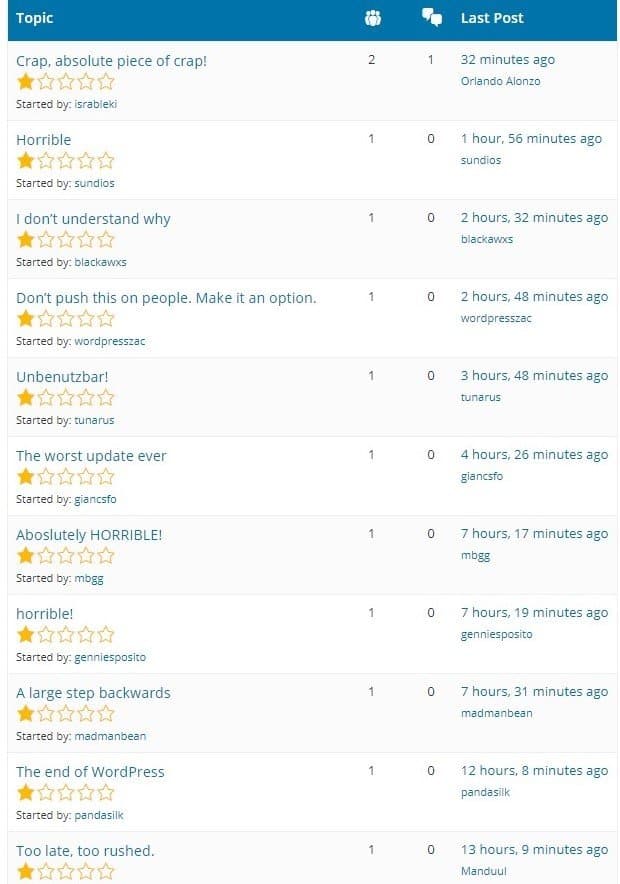
As you can see, those giving it a lowly 1-star rating aren’t exactly pulling their punches. Here’s a sampling of what unsatisfied users are saying:
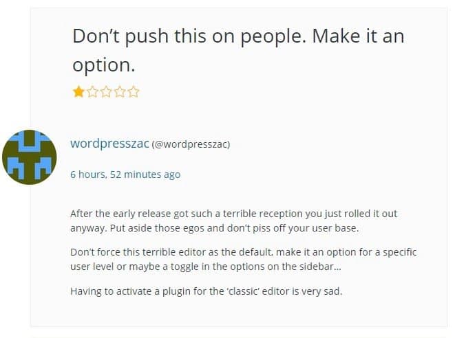
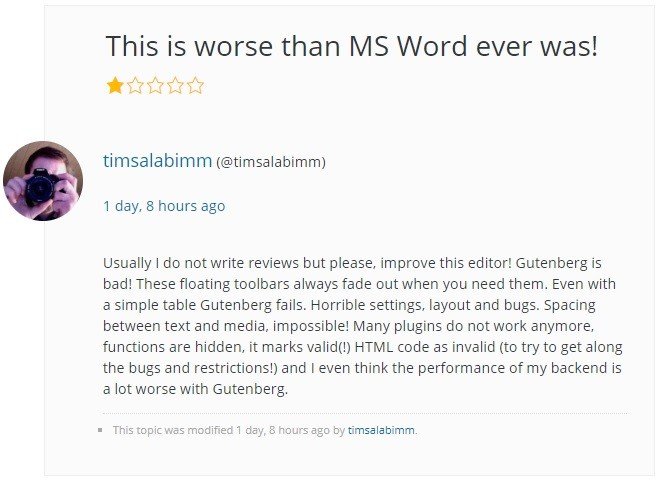
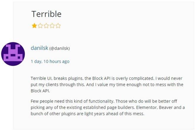
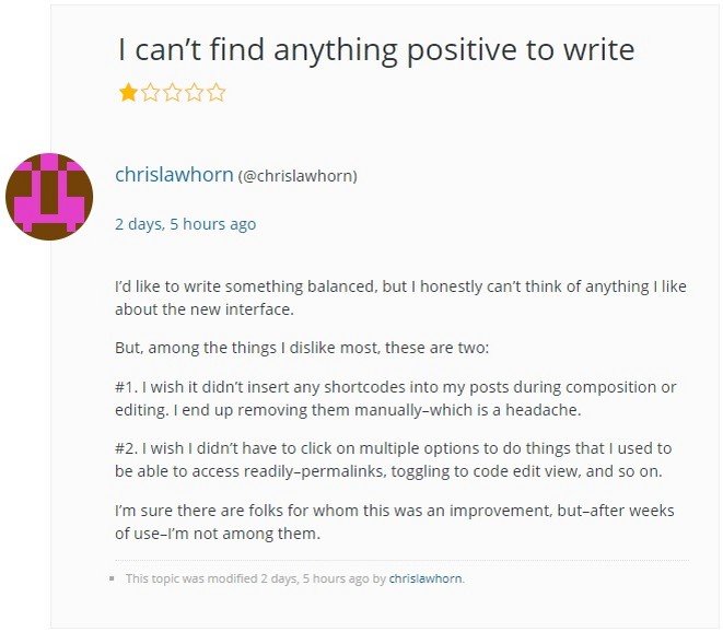
This sample is typical. It’s evident that people are finding there are many usability issues; problems with the interface, plugins, and themes “breaking,” problems with HTML coding, and many others. Many of these users would laugh in the face of anyone providing some of the advice pre the launch of Gutenberg, like this gem from the Hostgator blog:
“You may see some changes to page layouts, but it shouldn’t “break” your website.”
Evidently, it did “break” quite a few!
There also seems to be a pervasive “if it ain’t broke don’t fix it” belief – where changing away from the Classic editor to Gutenberg is the source of all the problems. It should have been left as an optional plugin, rather than being made the default editor, with users having to now use a plugin to go back to the old editor. There is clear resentment from a lot of users due to having it “foisted” on them without being given the option.
The Positives?
It’s not all bad on the review front for Gutenberg. There is clearly a large number who are indifferent to the change and are just getting on with learning and using it. After all, those who are the most unhappy are the most likely to be motivated to leave a review. Which may account for the heavily skewed reviews.
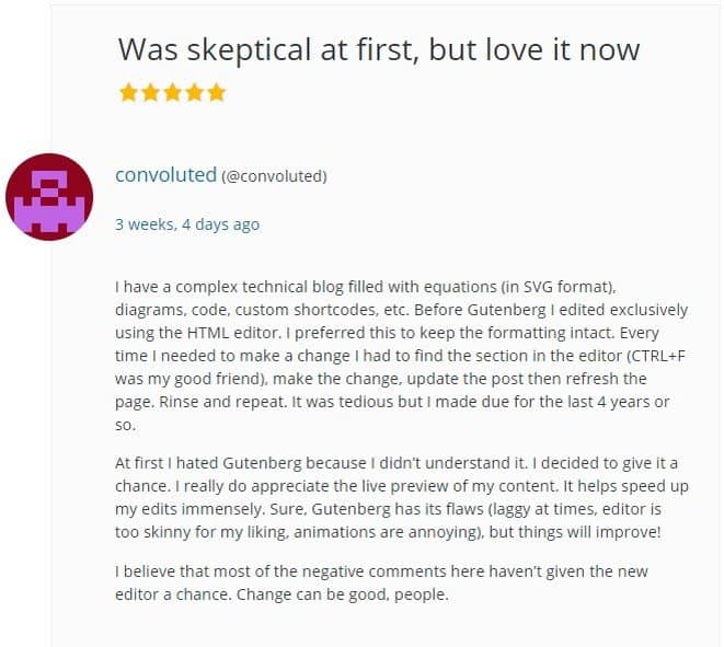
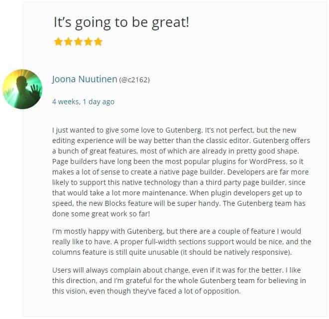
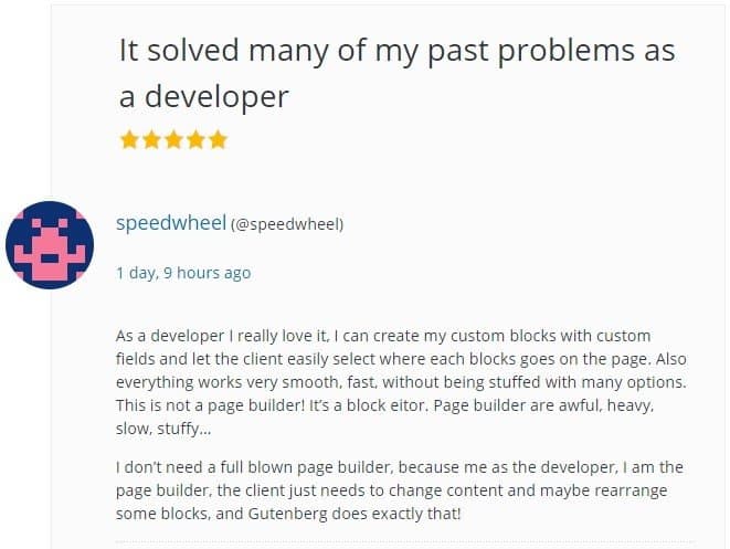
There are many who find the new editor to be a change for the better, and who appear to be buying into the vision Mullenweg has for the future of WordPress:
Where to for Gutenberg?
It’s obvious what Matt Mullenweg and WordPress are trying to achieve with Gutenberg. Simplifying and streamlining content creation, especially for casual and non-techie users, with an eye on future full customization.
Ironically though, it seems to be the casual, non-techie users who have taken the biggest issue to the change and been the most negative and scathing in their reviews.
Could this just be a natural result of the change? I suspect so. As a rule, most people don’t like change, and if users have been using the same unchanged editor for 10 years or so. Then, of course, there’s going to be pushback against having to learn something new. Especially when all the bugs and kinks haven’t been worked out yet.
The compatibility issue is one of the prominent negative issues. While understandably a huge source of frustration. To be fair to WordPress. It’s not so much a Gutenberg issue as it is an issue with the individual plugin developers who hadn’t adapted their product for the changeover.
While overall the reception towards Gutenberg appears to be weighted more toward the negative side. At least for the everyday user, it is seemingly here to stay. While there are those who say it should have been left as a plugin and not overtaken TinyMCE as the default editor.
That it was possibly rushed to market in a state that left a lot to be desired. As it is improved and issues get ironed out over time. Expect attitudes to change and become more accepting. Especially as those faced with a frustrating learning curve getting to grips with the new Gutenberg WordPress editor.
- Gutenberg WordPress Editor – What’s the Verdict? - February 19, 2019
Where Should We Send
Your WordPress Deals & Discounts?
Subscribe to Our Newsletter and Get Your First Deal Delivered Instant to Your Email Inbox.
