How to Analyze User Activity on Your WordPress Site Using Heatmaps
Did you know something cool about WordPress? Well, that fact is, above 413 million people worldwide view pages hosted on WP every month!! And it is projected to rise!
So if you have a WP powered website, it should make you pretty excited! Well, there is a catch. These views are distributed over 21.1 billion pages. Meaning you have lots and lots of competitors.
Thus you must be wondering how to stay ahead of the competition. Therefore I am writing this piece for you!
As the expectation of your users for a seamless web experience is rising every day, you have to have infallible (in case you thought my vocabulary was limited) data on how they perceive your website. Stacey Martinet, VP of marketing strategy and communications at Adobe, also agrees to this and says,
“Data is important in getting the customer experience right. A data-driven approach to creativity helps marketers work more productively, create the right content faster, and deliver that content to the right customer, across the right channels, at the right time.”
And analysis of your users’ activity data, my lovely and honored readers, is where using heatmaps can be extremely useful! Would you like to know how? Then please proceed towards the next piece of the pie!
What Is a Heat Map?
Now before you get your hopes up, let me clarify something. Heatmaps cannot tell you anything about what’s going on in your significant other’s mind! But it surely can give you a pretty good idea about the components of your web page users are liking (or not liking).
So here it is!
The heat map is a visual mapping of the way your users have interacted with your website. For example, it can show you which areas of your page have been viewed the most, which buttons received the highest number of clicks, in what way your users have hovered their cursors over the interface, etc. Allow me to show you how it looks like:

As you can intuitively figure out, the red area is where your users have spent most of their time. The green and bluish area, on the other hand, shows the least visited areas.
Types of Heat Maps
There are different types of heatmaps out there. Here we would be talking about four of them. Those are:
- Click Maps
- Scroll Maps
- Mouse Movement Maps
- Form Tester Maps
Let me tell you about each one of these.
Click Maps
Click maps give you a color-coded visual of the clicks the buttons or any component on your page has received.
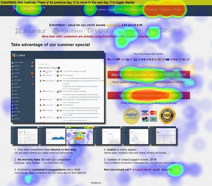
The red smudge on the buttons in top and mid-right have been clicked on the most by the visitors to that page. On the other hand, the bluish-green zones have received much fewer clicks.
This also shows that some parts of the page have been clicked on even though they are not buttons. This might mean that people may be distracted or confused by the page-layout or the aesthetics. It would be beneficial that you bring some changes. That way they would pay more attention to your CTAs.
Scroll Maps
Then there are scroll maps. Scroll maps color-code your page according to its traffic data. They are very helpful in quickly figuring out the parts of WP page maximum of your users pay attention to.
So if it turns out that some of the components/pieces of information you would want your visitors to concentrate on happening to be in the yellow (or sometimes greenish blue/blue) region, it is best that you transfer it to the red zone. It is highly likely to boost your conversion!

Mouse Movement Maps
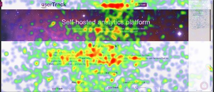
Later in the heat maps family is the “mouse movement heat maps.” They are also called hover maps. As the name suggests, this class of heat map shows traces of the way your user moved his/her mouse.
Even though it sounds very sophisticated, it might be highly misleading. Why? Well in most cases, there is no direct correlation between our mouse movement and part of the page we are focusing on. Even then, this, when analyzed in conjunction with other types of heat maps, has the potential to provide evidence to inferences drawn from them.
Form Tester Maps
Last but not least, form tester maps. Forms are an integral part when it comes to lead generation and ecommerce. You can’t afford to have a potential lead (who might convert into a paid customer) get frustrated and leave.
Thus, in case your lead generation is going downhill or not progressing at your desired pace, get your form page analyzed and have a form tester map generated. That would indicate at which part of your form, most of your users are bouncing from.
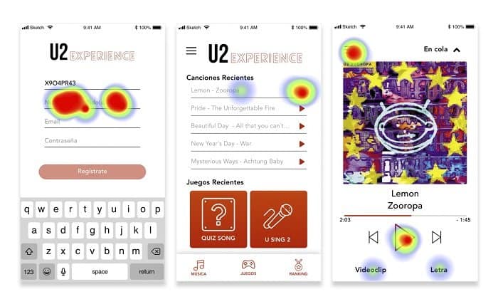
In the above form tester map, it can be seen that most people are bouncing from the first field in the form. Thus no colored regions are covering the second and third field.
In this case, review this form page relative to the previous page. Maybe users of this page had no interest at that point to sign up for anything. For example, you can place this form in a different part of the page. Or maybe the design of the way needs to be more interactive. Remember, the devil is usually always in the details (and you thought that’s only true in detective movies)!
A Holistic Approach to Users’ Activity Analysis
So far we have talked about different types of heat maps and how they can be individually helpful. Now I would give you my secret sauce of users’ activity analysis using heat maps.
The first step is to have a scroll map, click map and a hover map generated.
After that, you would probably want to chill out a little. No harm in that. But don’t think you are done! The real (and fun of course) part begins now!
Compare your scroll map with your click map. If possible, put them on two screens.
And then compare every detail of your page present on both maps.
CTA
Has your CTA received a higher/lower number of clicks compared to the attention that part of the page has received (your scroll map would tell you which area has received higher user attention)? If so, then probably it was hard to find. Or it was not compelling enough that people would click on it.
Or the opposite might be right. Let’s say 30 out of every 100 visitors scrolled to the bottom of your page. Thus that area is blue on your scroll map. But a button placed there was clicked on by 23 of those 30 people. That means that you would probably have more engagement from your users if you shifted that button to a red zone of your page (red does NOT mean DANGER here).
It might be a painstaking process. But it would give you return in manifolds. So keep calm. And don’t lose the Sherlock hat!
Try to come up with as many inferences as possible. One of these would turn out to be the reason behind that spike in your conversion that you have been longing for!
This step is the most crucial one. After this is completed, you would need to figure out which one of the inferences you derived in the previous step makes the most sense. If required, try to consult an expert.
Now that you are armed with that Intel, you can soon come up with a probable design change for your WP page. At this point, you are like that assassin who has just received the photo of his target (lock and load time)!
Before you go for the testing of your WP page change, you have to keep something in mind.
That is, your inference from the heat maps is NEVER 100% accurate. It is what they call an “educated guess.”
A/B Testing
Your A/B testing (also called split testing) might reveal it to be far from what you inferred. So have an open mind and proceed.
User Session Replay
After you have zeroed in on what is likely the issue that is causing your page to perform poorly, there is another test you can perform for confirmation. This is not mandatory (nothing in this article is. I am just telling you what I have benefitted from).
This test is called “user session replay.”
These are actual screen video sessions recorded when a visitor is browsing your website. Yes, it is possible (not exactly rocket science). No, it is NOT illegal. So don’t expect the FBI to show up at your door.
The downside of user session replays is that these are time-consuming. Usually, you have to sit through hours of sessions to be able to deduct something useful. But many WP page owners have benefitted from this. Maybe you would be one of them too!
The heat map plugins for WordPress usually provide this service. I would reveal some of those down below. (I love raising anticipation! Can’t help it).
The Story Is Not Over
If it makes you even a little uneasy or discouraged, don’t lose heart. I use this effective mantra. You might find it useful as well. It is that, with every test, you are getting one step closer to the change that would skyrocket your conversion!
I have finished telling you as much as I could without scaring you away! Except for one thing.
Throughout this article, you have probably been wondering how to generate a heat map for your WP page. Even though I have managed to keep you highly interested (I hope!) in my article so far, this question kept nagging in the back of your mind. It has got to the point that you can’t take it anymore! So here you go.
It may seem very complicated. Rest assured. It is NOT.
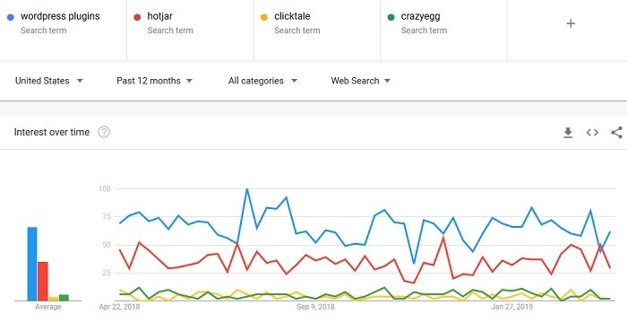
All you have to do is add a heat map plugin in your WP dashboard. Among them, some of the best and most popular are hotjar, clicktale, and crazy egg. Below is a Google Trends chart comparing how frequently people have searched these over the last six months.
These come with detailed instructions on how to install and get them up and running on your WordPress website. Just follow them one by one. If you find this a nuisance, ask your WordPress developer to do it for you!
In case you are too busy, then know that there are plenty of analysts who would love to have a good time with your data. Yes, you need to pay for them — no such thing as FREE lunch. Just visit Upwork or Fiverr, and you would find many people who probably make a living out of data analysis. They usually charge from $75-200.
If you are interested in getting an even more in-depth analysis of your website user activity, then you can get eye-tracking services. There are several companies which provide various levels of eye-tracking service charging between $1,000-1,300. Some of the more sophisticated eye-tracking services cost way over $10K. Don’t freak out (not on my watch)!
Those services are usually required by data scientists or researchers working on AI and machine learning. So not something YOU would need at this point.
This combined with all your heat maps would give you a more productive evaluation of your website user experience.
Takeaway
- The best practice is to have at least a scroll map, and a click map generated. Then compare them for valuable nuggets of deductions.
- Generate the heat maps after about 25,000 visits or 3 days of WP page activity. That way, you are highly likely to deduce reliable information.
As your WordPress page gets an increasing number of visitors every day, you would find yourself in a greater need for quick analysis of the activities of your users. So in the foreseeable future, the importance of heat maps for you is not going to decline. For your own sake, you should master its use.
Good luck my lovely WP people!
- How to Analyze User Activity on Your WordPress Site Using Heatmaps - April 30, 2019
Where Should We Send
Your WordPress Deals & Discounts?
Subscribe to Our Newsletter and Get Your First Deal Delivered Instant to Your Email Inbox.
