What Your Visitors Expect from Your Website Design in 2017 and 10 Ways to Live up to It
Not having a website for your business in 2017 is almost unforgivable. Having a website that stands out is a must. Do you know how many websites are there? Over a billion! With so many websites available, web visitors are now spoilt for choice and are demanding more from web owners.
Having a website is not enough; your website has to fulfill the site visitor’s expectations. So what exactly are visitors looking to find on your website? Let’s take a look at the 5 most important aspects of a website.
- Speed/Loading Time
Nobody wants to waste time trying to load a web page. The slower your site is, the higher the bounce rate you’ll get. With so many options available, people are losing patience faster than ever. So if you don’t want people to move on to your competitor, you better ensure that your site is pretty fast to keep web visitors interested.
- Organization
Once the web visitors land on your site, you want to capture them from the very beginning. Having a distorted web page will only confuse them. Remember, web visitors don’t have all day to spend on your site. They want a website where they can find the information they are looking for in the shortest time possible. Ensure that your website is well-organized to enhance your user experience.
- Easy to Navigate
Make your website more user-friendly by making it easy to navigate. Make it easy for your website visitors to explore more pages. Label your pages clearly, use easy to recognize icons, and direct people to where the important information is. It would be nice to have a search box so that it’s easy to search for specific info on your site.
- Offer Value
Stand out of the crowd by being the guy who offers value to their visitors. People want to land on a page that helps them find what they were looking for when they typed their search words on a search engine. So make sure that if you use certain keywords to market your website you must deliver value for those keywords.
- Aesthetics
Finally, aesthetics are a very vital part of any website. People are sight creatures and they will be fascinated by what they see. If your website is not a brand, chances are that they will trust you less and thus move on to the next site. Wow your visitors by making your website visually appealing.
10 Useful Resources to Help You Fulfill Your Site Visitors’ Expectations
So now that you know what your visitors expect from your website, let’s take a look at 10 useful website design resources that you should use to deliver on these expectations.
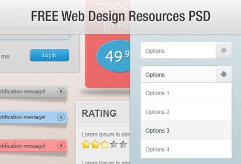
To improve user experience through a fast loading page and easy navigation, you need a good website design. One that is user-friendly and responsive. This package of PSD design resources has 7 PSD designs that you can use for your website. The designs are clean, responsive and compatible with any browser. They are also compatible with any type of device including mobile.
With such designs, it will be very easy for visitors to access your website either on PC or mobile. The scroll down on these website designs is pretty easy and user-friendly making navigating through the site a breeze!
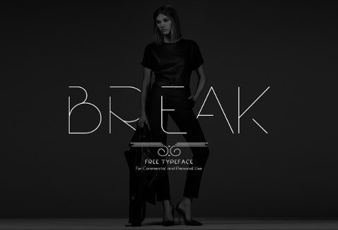
Fonts are a great way to improve the look and feel of our website. Capture the attention of your web visitors by using a modern font such a Break. This font will give a modern edge to your website keeping it in sync with the latest website design trends.
Change your fonts every once in awhile to keep your website fresh. Break is perfect for highlighting headlines or taglines. The font comes in bold, semi-bold, regular, light and extra light. You can also use it in uppercase, lowercase, numeric and symbols. The font is available in TTF format.
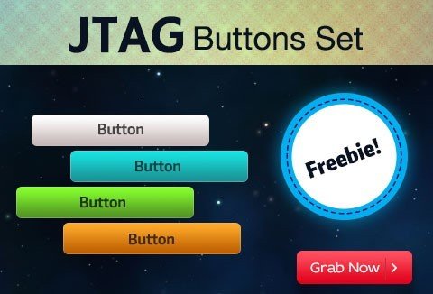
To get people to take the desired action on your website you have to literally ask them to. If you want them to buy a product you have to remind them to do so. The best way to do this without putting them off is by using a call to action buttons.
Call to action buttons are very effective in converting your website visitors into actual leads. If you place your call to action buttons correctly, you will receive amazing results.
Instead of creating a new call to action button every time you are running a campaign, get these 105 Editable Call To Action Buttons. These buttons are in high-quality PSD format and you can slice and add them to any website.
When using a call to action button on your site ensure that you use clear text that creates a sense of urgency. Place the button above the fold. This is the areas where visitors first land before they have to scroll down.
Ensure that your button is big enough to be found easily but not too big that it’s distracting. The size of your button should also be appropriate for mobile screens. Also, ensure you use colors that will let your button stand out from the rest of the page.
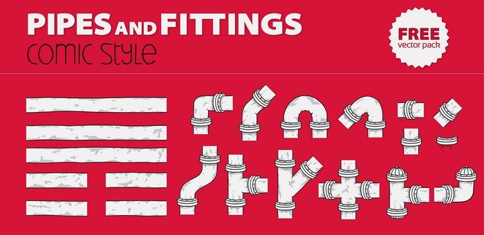
People process visuals faster than text making images an integral part of web design. This pack of vectors will be a great addition to your web design resources. They are easy to use as they are ready made and will only need a bit of tweaking to make them fit into your design.
These vectors will save you time and effort as you try to make your site more visually appealing. They will make your website look more beautiful and appealing. Vectors are great if you want to increase your page views.
Hand-Drawn Web Design Elements
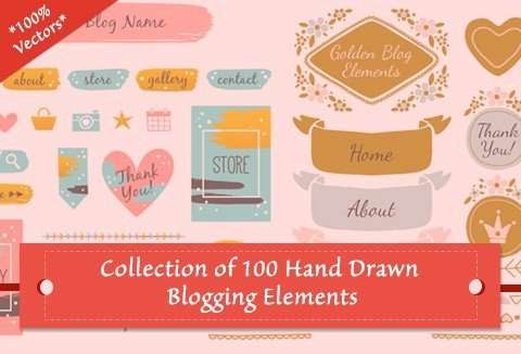
To further extend the aesthetics of your site, make use of these hand-drawn web design elements. The pack comes with a collection of 100 Hand-drawn web design elements. You can perfectly use these elements to show your brand creativity, to showcase your products and services in a unique way, to create the perfect first impression that lasts and to give your website a professional appeal and look.
When using these elements, make sure that you use space in between lines of text to make them more readable. Also, ensure that your navigational menus are few to prevent overwhelming your visitors.
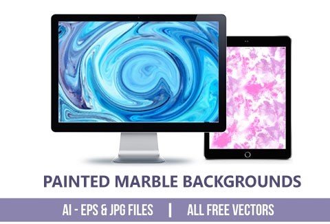
Vector background patterns are another way of making your website catchy and to arouse curiosity. Background patterns get people interested. This pack comes with 14 painted marble free vector background patterns that you can use for your website background.
The vector patterns are also great when designing posters and flyers. You can also use them for print designs such as t-shirts and banners to use as advertising material.
When using these patterns, highlight different parts of your website background through the use of lighting effects.
Make sure you choose patterns with colors in the same palette and intensity to make your background more cohesive with the rest of the site. Maintain your website’s symmetry by using a centered, tiled or scaled image on your background.
Don’t forget to add transparency to create contrast. Transparency will also allow your text to pop off your background making it even more attractive and effective.

Social media has opened up a whole new avenue for companies to conduct business. It has grown to become one of the biggest marketing strategies. However, its success largely depends on how well you utilize the various social media platforms.
Social share is one of the areas that utilize social media to the fullest. You have to share your content for there to be any social impact. Sharing your content daily can be overwhelming. That’s why having a reliable social share plugin is a must.
A good plugin will make your website content social-share-friendly and increase your social reach exponentially.
This plugin allows you to share content on popular social media platforms including Twitter, Google+, LinkedIn, Pinterest, Stumble Upon, Reddit, and Buffer. The plugin allows you to select or restrict the content to be shared. You can add social share buttons on the right or the left side of your WordPress site.
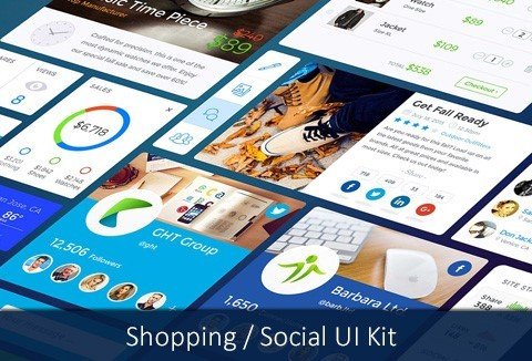
A user-friendly interface will be the reason why people stay longer on your site. This featured UI kit offers the much-needed appeal for any shopping or social site. The kit has highly scalable vector graphics, comes in layered PSD files, it’s retina ready and you also get free open fonts.
Autumn Hand Lettering & Watercolor Designs
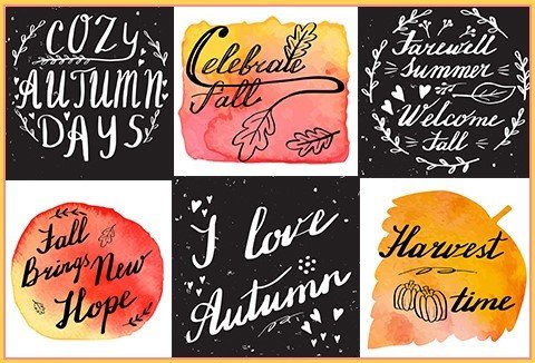
Get your website noticed by using hand lettering and watercolor designs. Hand-lettering stands out in a more authentic way. This collection comes with 6 autumn hand lettering and watercolor designs that you can use for your website backgrounds, fonts and more.
You can also use the designs to enhance your branding material by designing posters, t-shirts, billboards, greeting cards, gift tags, business cards and much more.
The 6 designs come in form of 3 handwritten texts on abstract hand painted watercolor texture and 3 modern brush font and calligraphy designs on the autumn theme.
![]()
Icons have been here for decades but they are still as important today as they were years ago. Icons are great for your website because they carry a lot of info without the need to use overwhelming text.
They are also great in guiding a web visitor on what is on your site and where to find it. Icons allow you to save space and they will effectively break website monotony.
When using icons, make sure that each icon is different from other icons near it but still work well with the rest. This will make each icon stand out and avoid overwhelm at the same time.
Final Thoughts
Giving your website visitors exactly what they are looking for in a website is a surefire way to increase web traffic, improve conversion rates and consequently increase your sales. So go ahead, make the best use of these web design resources and see your website improve multiple times over! And if you still need help, you can always rely on professionals like Web Design Alcester.
- Using WooCommerce? Optimize Sales With This CRO Tool - February 26, 2019
- Match the Trend with a Clean Website UI for Your WordPress Blog Site - March 8, 2018
- Market Your Brand Using Social Media Reviews Plugin - November 20, 2017
Where Should We Send
Your WordPress Deals & Discounts?
Subscribe to Our Newsletter and Get Your First Deal Delivered Instant to Your Email Inbox.

