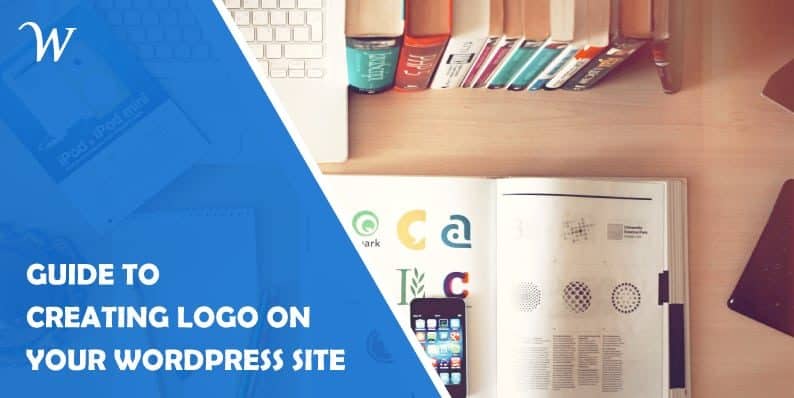
Everything You Need To Know About Creating Logos In WordPress
The last time you drove near two golden arches shaping the letter M, you probably got a bit hungry. It is safe to say that when going shopping, you are likely to pick something you can easily recognize as the “trusted version” of a product. You might also give a suspicious look to anyone staring at a device that doesn’t have a bitten apple on it.

If you have ever wondered what the purpose of a logo is, the abovementioned is. There are many reasons to create and use a logo. Some of them you already thought of while you have been reading the previous paragraph.
What is the purpose of a logo?
“Work until you no longer have to introduce yourself”, they say. You can see this example with numerous celebrities and famous people. Still, you own a company, and you are probably swamped with work, so this saying might not come true for you in a while.
However, just because you are not out there in person raising awareness of yourself and your business, doesn’t mean that you will never get the recognition you need. That is the main purpose of a logo. The logo is your business’ face which people will see and interact with every day, making the saying true for your business too.

A good logo will bring your business the recognition it needs to build trust. In today’s world, when people are often overwhelmed with choices and offers, it is important to be able to stand out from the crowd as a trustworthy one. It is the same for WordPress sites as it is for ketchup brands, especially because there are one too many websites out there.
That is the main reason why you need a logo for your WordPress site. You need to put a “face” on your business to help people remember it. If the logo is good, you can rest assured that people will more likely click on your website if they have already seen it somewhere, rather than the competitor’s website.
What kind of logo should I use?
As you have probably noticed, some businesses rely just on graphics for their logo, others use a combination of graphics and lettering, and others use effective fonts to create their logo out of their business’ name. These are famous in the logo world as logomarks, combination marks, and logotypes, respectively.
Logomarks
When you hear the word “logo”, you probably envision a logomark. These consist of a single image, which tries to capture the essence of business they represent.
Think of Apple, or Toyota logomark. The latter, for example, consists of three circles which represent the customers, their product and technological advancement, unified together. While this is an amazing accomplishment, it is definitely no easy task.

It is also the reason that Logomarks only hold 5% of all the logos today. If you are considering creating this logo for your WordPress site, do think twice, as these work very well on physical goods. Online? Not so much.
Logotypes
Unlike logomarks, logotypes are all about the name of the company, right font, and colors. Corporate business often chose this type of logo, as the only challenge here is to pick the right font and colors to build your brand on.

If you are wondering about these, think of Google, PayPal, or CocaCola. These names always pop up, and are easily recognizable, as it takes one look to find out which company stands behind it. Logotypes take up to 30% of all logos at the moment and are not the worst choice to make for your WordPress website.
Combination Marks
The most common option and the recommended one for your WordPress based website are combination marks. These take the best aspects of the previous ones, and they look good on your site, too.

While these include both a symbol and watermark, creating the right one could be a bit of a challenge. Still, the benefits are double, as you can, eventually, use one part of your logo, or other, if occasions for so arise.
Difference between high and low-quality logos
It doesn’t matter whether you hire someone to do it for you, or you opt for do-it-yourself versions for your logo – there are some key aspects to look for. Make sure your logo follows these guidelines so that you don’t end up with a low-quality one. It could do your company more harm in the long run.
1. Simplicity
You don’t want your logo to scare people away, so make sure you make it as simple as possible. Use white space as your advantage, and try to streamline it as much as possible. “Less is more” is quite true when it comes to logos. Just do it, but don’t overdo it.

2. Readability
If you are going for a combined mark or a logotype, you should consider the font as the main thing to worry about. Make sure it is readable, and that your new customers don’t have to try too hard to understand your business’ name. Just like with the point above, make sure it is simple, and easy to read.
3. Scalability
While this guide is for WordPress, eventually, you will end up using your logo on several different places. It could be your business card, in the header of an invoice you send, or on some custom-made gifts for your new partner. Using digital business cards is another way to expand your reach as they offer a modern, eco-friendly alternative, allowing you to easily share your contact information via email, social media, or QR codes. Your logo needs to be able to adapt to these changes in size and shape. If people can’t read your logotype when it is a bit smaller than you are used to, you should consider creating a logomark as well, just in case.

4. Longevity
There is nothing wrong with trend-following as long as you keep in mind that trends change every too often. If your logo is top-notch according to recent design trends now, you need to regularly update it to stay on top of its game. This could happen more often than you can imagine. So, opting for a logo that will stand a test of time and be relevant ten years from now might not be such a bad idea.
5. Uniqueness
Does your logo stand out as much as possible? Uniqueness is the key to designing a quality logo. If you have a logo that is too similar to someone else’s, chances are, you will have them think of someone else, and leave to go there. So, focus on making it as unique as possible. Make sure it is not borderline unpleasant, though.
Picking a Shape, Color, and Font
People tend to think that creating logos is all about what you think looks pretty. The truth is, there is a lot of psychology involved, as different aspects signalize different things to the end consumer.
Shape Psychology
Should your logo be square? Round? Good questions and their answers depend on what you are trying to tell your customers in return. This is where shape psychology gets involved. Let’s check what you are conveying to your customers with different shapes.
Circles
Circles are the perfect choice if you are looking to create unity with your customers, just like Toyota did. They resemble rings, which are commonly used to seal the deal in marriages, for example, so they also stand for steadiness and commitment. Furthermore, they are softer and therefore welcoming, so if you are looking for trust and commitment from your customers, you might want to go with the circle-shaped logo.
Squares
Unlike the softness that circles represent, squares are sturdy and tough. Often these shapes are used to convey professionalism and security, by companies trying to tell you that you are in safe hands with them and that you can trust them with your problem they are looking to solve. The square shape also gives you the opportunity to tell a story within the space.
It is probably one of the best shapes to use to stay relevant for much longer than with other shapes.
Triangles and Spirals
Spirals – the movement of this type of logos is rather enticing, and are the perfect fit for organic businesses. Triangles, on the other hand, symbolize sturdiness, movement, and growth, which could be a perfect fit for some industries. Both of these are gaining prominence in modern logos, but if you go with one of these, you are probably looking for some regular updates of your logo.
Color Psychology
Each aspect of your logo plays an important role in how people perceive your logo, and therefore, your business. Color has a special place, as it can convey the feeling just as accurately as shapes.
Using color psychology can also benefit your logo. Green color, for example, symbolizes growth and prosperity, depending on the shade of green. You can use yellow to communicate happiness, which is what McDonald’s used because most of us connect junk food with a temporary fix of happiness. Red, on the other hand, can be tricky. If not done properly, you risk throwing your customers away, as it usually stands for both passion and danger at the same time.

You can’t go wrong with blue, green and gray. Blue is a peaceful, mindful, and calm color, which is the same emotions your logo will initiate in your customers. No wonder big companies are using it, which therefore adds an additional layer of trust to blue logos. Gray can come as a great stand-by color for either blue or green, spicing it up a notch.
Fonts
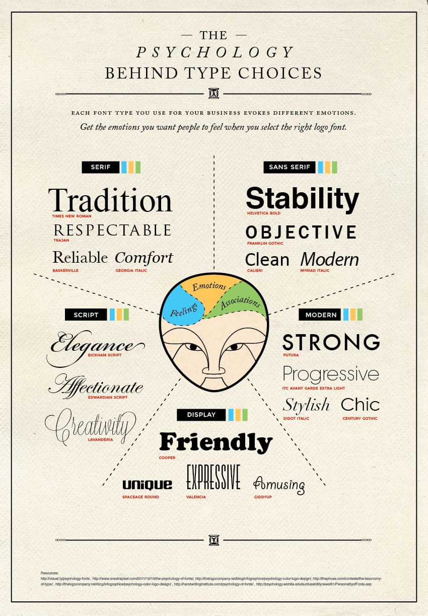
While colors make 90% of the first impression, fonts are not to be taken lightly either. There is another aspect for you to consider – which font to choose to convey the message you would like to convey. Here is an extraordinary infographic to help you out with making that decision.
How to create a logo for your WordPress site?
Essentially, there are three ways to create a logo for your site. You can choose:
-
Do-it-yourself
This solution is rarely the good one, unless you have, or are planning to obtain some designing skills. If you are looking to create one yourself without any experience with logos, you will still do well with what you have learned in this article. Fire up that Photoshop, or any other online replacements, and create away!
Still, hiring a professional is never a bad idea. Especially, as soon as you can afford it.
-
Hire a designer/branding team
This is the safest option, yet a costly one. While having your logo professionally designed is the right thing to do, when your business is yet to launch, it could be too expensive to happen. Still, a great design will help immensely, for both your logo and your branding efforts. The truth is, there is a lot to branding than just a logo, and it could be a great help to your business to have a team of professionals do it for you.
-
Online generators
The quick and useful solution to getting your logo without too much hassle or communicating with anyone. Just like many other builders available to help entrepreneurs launch their business, this one can help you tailor your logo in no time.
Most of them require no designing skills of your own, but you still get the perfect and unique logo for your business, following the right standards.
For example, BrandCrowd, one of the most popular logo generators makes it effortless to create a logo.
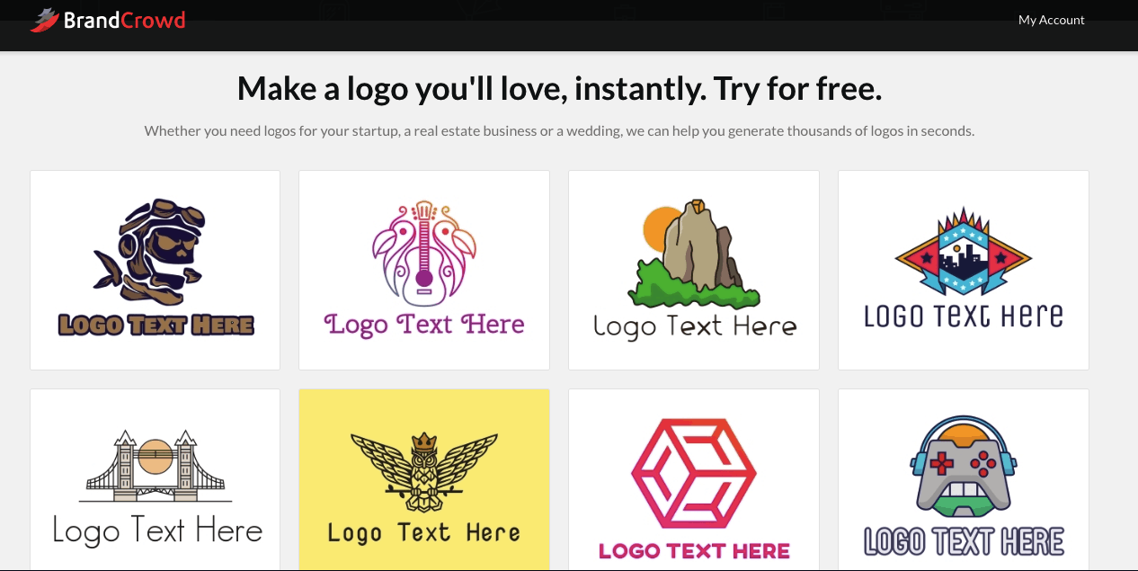
What you need to get started is to type in the name of your business. The generator will automatically present over 5000 logos for you to choose from.
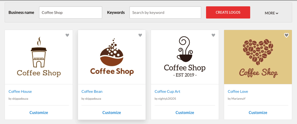
Once you find the right-looking logo, you can further customize it to your liking, and to make sure that it passes all of the quality checks mentioned above!
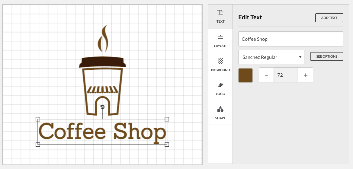
Voila! You have a logo.
How to add it to WordPress?
The quickest and effortless way to add a logo to WordPress is to simply click on Appearances, and then head on to Customize. From there, all you should check out is your Site Identity tab, where you will find the “Add logo” section.
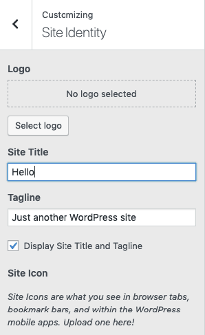
Not all logo adding in WordPress will be this simple. Some of the themes you could be using for your site might not support this option. So, if you don’t see the “Add logo section”, it is probably time to hire a developer to do that for you.
There are many tutorials online on how to add the logo to the theme, yet this could cause a bunch of other serious problems with your site. In the best-case scenario – it will get overwritten with the next theme update. The worst-case scenario is that you can create some serious security issues on your website, which can cost you too much in the long run. The developer is likely to create a child theme to add your logo. He or she will also see the process from beginning to the end, and ensure that your logo is where you want it while keeping your website intact.
Back to you
While it doesn’t seem like much, logos have a far greater influence on people that they might seem. Nothing about any logo is an “accident”, some of them are planned for ages beforehand, tested, and modified to serve a greater purpose.
Since most businesses nowadays revolve around a customer nowadays, it is important to create trust and for them to be able to recognize you everywhere, and come back to you whenever they need a solution to their problem that you can provide.
Your logo should give you recognition and credibility your business deserves. Follow this article to get or create one in no time!
- The Beginner’s Guide to .htaccess - October 25, 2023
- Best WordPress Christmas Deals and New Year Discounts 2019 - December 17, 2019
- Get The Best Performing Online Store With WooCart - November 25, 2019
Where Should We Send
Your WordPress Deals & Discounts?
Subscribe to Our Newsletter and Get Your First Deal Delivered Instant to Your Email Inbox.
