9 WordPress Web Design Myths and Mistakes to Avoid
Talking about factors that draw a large number of visitors to a WordPress website, people often neglect one simple thing: web design.
You possibly do not know this yet, but mistakes in your website design can damage your overall turnout! Why? Let us look at some reasons (and advice), shall we?
First, a nice web design equals a nice first impression, which is vital to your website since a bad one might make people go away at once. Second, the quality of your web design determines the trust people put on your website. It is only natural that we place more faith in products with higher quality, don’t we?
Thus, a WordPress website with better design will keep customers closers. Before you put your hands to work, however, bear in mind that web design is not as simple as how you make your site look, but also how you make people feel about it. If the interaction process between your website and your users smooth, you win the game, or else, you lose. Its importance is undisputed, so it’s not a surprise why so many users reach out to the pros like G Squared web design to give them a helping hand in these crucial tasks.
That is for you to see how web design can be detrimental to the success of your WordPress business. Now, in order to prevent you from making a mess of your WordPress web design, here is a list of myths that are NOT true:
- Too Much Clutter Web Design can be Good
- A Slow-loading Website is OK
- Mobile Website is Not Necessary
- It is Good to Have Large Blocks of Text
- Visuals Need The Most Attention
- Navigation is Not Important
- We Should Not Waste White Space
- It is not Essential to Keep up with Trends
- Thanks to Stock Photos, I Don’t Have to Add My Own!
No, no and no! There are 9 No’s in total, but why no? Let’s find out!
Too Much Clutter Web Design Can Be Good
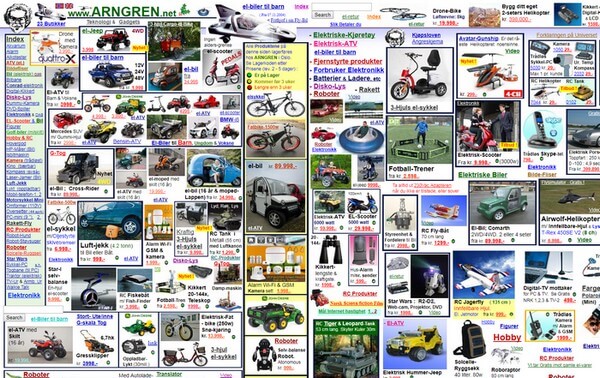
No, it is NOT good.
Designers, whatever you do, just remember one of the most important rules in design: Simplicity is the ultimate sophistication. Since a good design must bring focus, guidance and content hierarchy, a page cluttered with too many texts and other elements is obviously the opposite of this goal. Hubspot found out 76% of users believed usability was more essential than the design! Therefore, if your users feel dizzy looking at your website, you fail.
In that case, what should you do? Well, the advice is:
- Make it simple: If you already have too much clutter on your website, you should consider what can be omitted. Clarify what you want to do with each page of your website and add appropriate elements only.
- Leave white spaces: Enough white spaces is very crucial because they let your design breathe. They also enable your users to pay sufficient attention to the main elements on your pages.
- Be consistent: When you feel the need to change, reduce or get rid of something, do it gradually. Don’t make any sudden changes in layout and sidebar positions, as well as color scheme!
Mobile Website Is Not Necessary
Many people are wrong to think that their customers do business on desktops mostly so they do not need to make their website mobile-friendly or responsive. The truth is the percentage of mobile phone usage is increasing day by day. In fact, Statista lets us know that approximately 50% of web pages in the world are viewed on mobile devices, as of February 2017, and the number is growing! So, if you fail to optimize your WordPress website for customers’ mobile devices, you could end up losing every single one of them.
Don’t want to see that happen? The only way is to make your site mobile-friendly and responsive now if that is something you haven’t done!
A Slow-Loading Website Is OK
I assume that you all know that the statement above is false, right?
Because speed is a critical factor for any website, a slow-loading website is not OK and will never be. Thus, before you decide to integrate all the JavaScript animations or similar latest technologies into your WordPress website, mind the performance! Too much of anything can make your site speed suffer. And when it is indeed the case, well, your visitors will not see whatever you want them to see since they surely cannot wait for it to load!
Since it is so essential to have a speedy website, you should place it at the top of your priority list. Note what I said: people value usability over design!
Visuals Need The Most Attention
Talking about visuals, there is yet another problem: While some neglect it, some others put too much effort – more than necessary – into it.
I agree that look does matter a lot to the success of a web design, but it does not necessarily need the most attention. What is more important is whether you get your message across to visitors. Let’s put it this way: What is the point of a beautiful site if it is uninformative? The success level of your WordPress web design will be the total mark of both visuals and message. Remember that!
It Is Good to Have Large Blocks of Text
Some web designers choose to display text in large and uninterrupted blocks, which is not an advisable thing to do. Why?
Visitors have a tendency to go through your post to see what it is all about before reading, large text blocks will make it difficult for them to do so. That is not to mention the fact that they are hard to read, strain our eyes and literally devalue the appearance of your site! In that case, even the most worth-reading content will all be pointless because visitors find it tiresome to read it.
Would rather not to see that?
- Use different fonts, font sizes and colors for different text elements;
- Break up large blocks of texts into small paragraphs;
- Make full use of headings, sub-headings, and visual elements.
We Should Not Waste White Space
Contrary to what you may believe, white spaces are not wasted spaces! Uses of white spaces help your website look clean and simple, allowing you to take advantage of bold texts and bright colors to highlight important content! White spaces are also useful in cases of call-to-action texts. Thus, if you are thinking about using more white spaces in your pages, do not hold back!
Navigation Is Not Important

Another word for navigation? Menu! Since we are talking about something that helps visitors get around your website, of course, it is important. The best thing to do is to keep it simple and easy to use. In this regard, WordPress offers us many options for a useful menu. However, some people choose to count on CMS for the job, which results in a confusing menu, making it hard to navigate.
What to do then? Take advantage of WordPress’s menu options by going to Appearance, choose Menus and make a decision!
It Is Not Essential to Keep up with Trends
For readers, content is of the utmost significance. Yes, that is true. But to think that as long as your content is informative and worth reading, there is no need to keep your website design updated, is a tremendously wrong thinking!
Trends come and go every month, and it is not necessary to catch every trend there is on the Internet. However, it is important to bring your WordPress web design to an expected standard. Responsive design is a good example for almost all websites nowadays have integrated this feature into their design. That is to say, modern developments are not to disregard, or else you will run the risk of making your site a completely out-of-date one.
This is specifically worth noting down if your company works in the technology domain. Surely, you don’t want customers to view your site as outmoded, do you?
Thanks to Stock Photos, I Don’t Have to Add My Own!

Stock photos are great! They are always available, numerous in quantity, and cater to every single need of ours. However, using too much of them may make you look boring and unprofessional! Therefore, you should use your own photos sometimes as a way to tell your own story in a unique way and make your site different. While you’re at it, anyway, make it well done.
In case you don’t have much time and desperately need stock photos, have your designers to customize the images a little bit so they won’t look exactly the same with those old stock photos we see in the original source.
Wrapping Up
You see, these 9 WordPress web design myths and mistakes may look trivial but many people have stepped on them already.
I hope that with this article, you will not be the next one!
- WhatsApp Chat – WordPress Communication Has Never Been Easier - March 23, 2019
- Pergo – More Than Just Another WordPress Landing Page Theme - February 15, 2019
- Affiliate Coupons – The Money Making Assistant For WordPress Affiliate Marketers - February 1, 2019
Where Should We Send
Your WordPress Deals & Discounts?
Subscribe to Our Newsletter and Get Your First Deal Delivered Instant to Your Email Inbox.
